JobCommander App
Interactive Design, Responsive
2556 x 1179 pixels
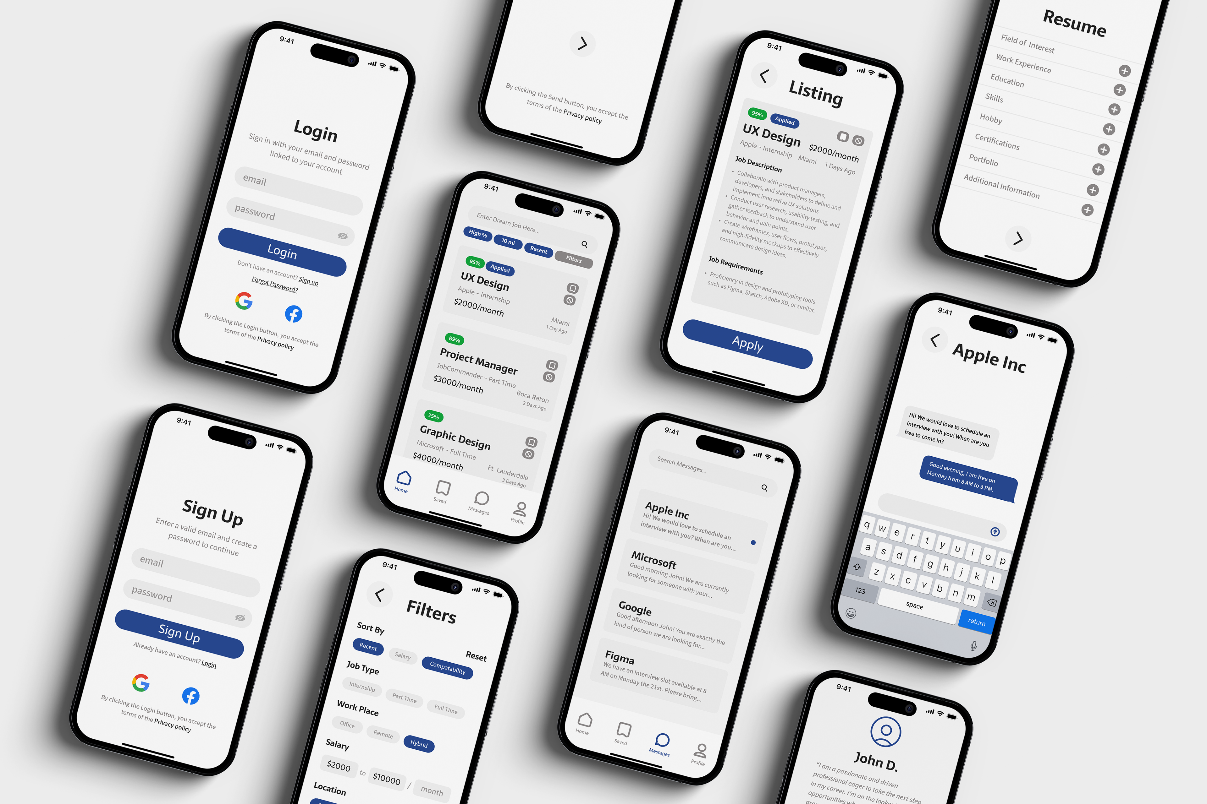
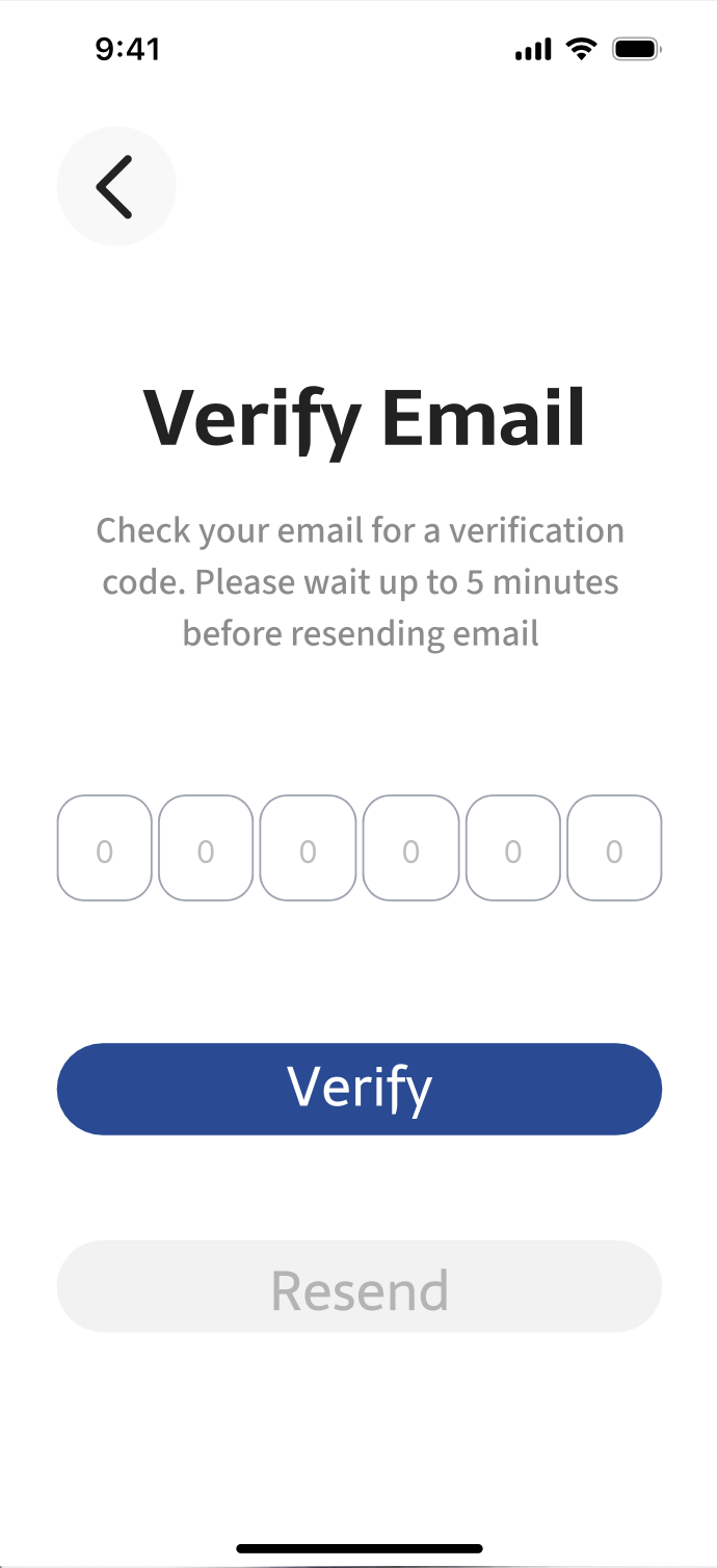
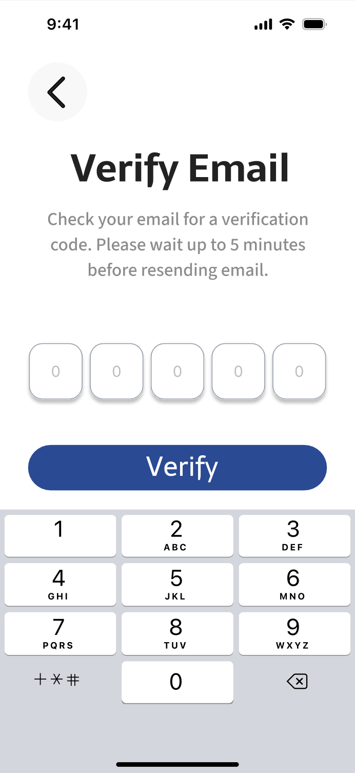
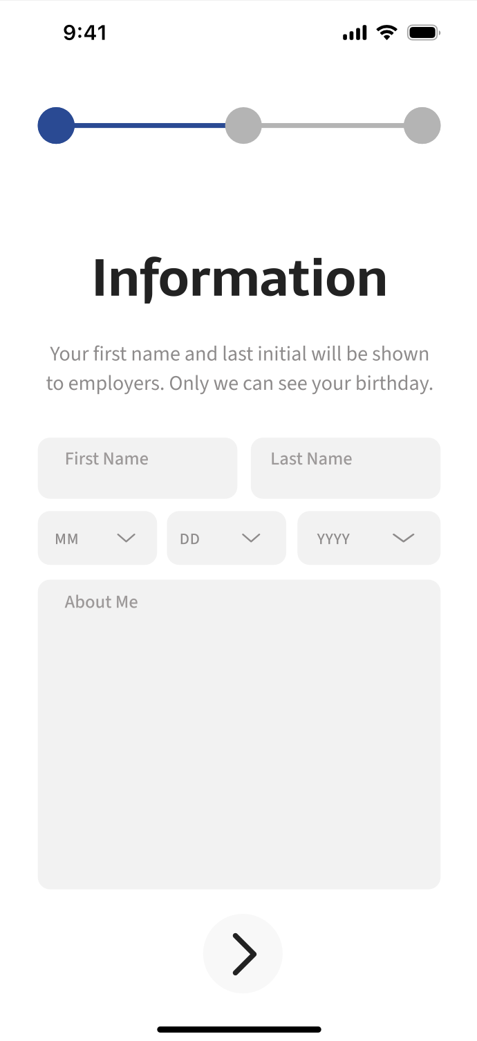
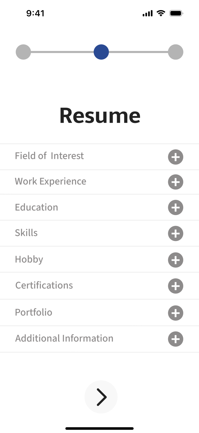
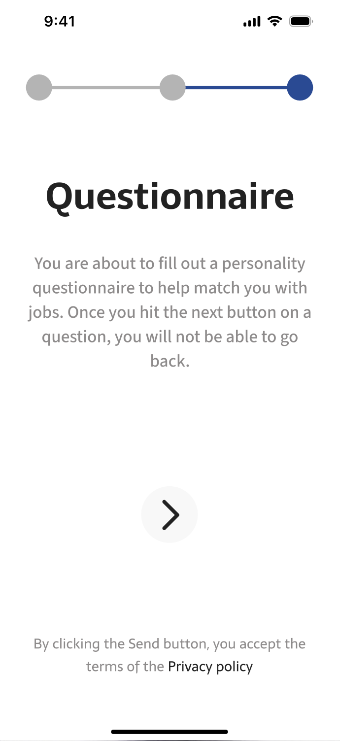
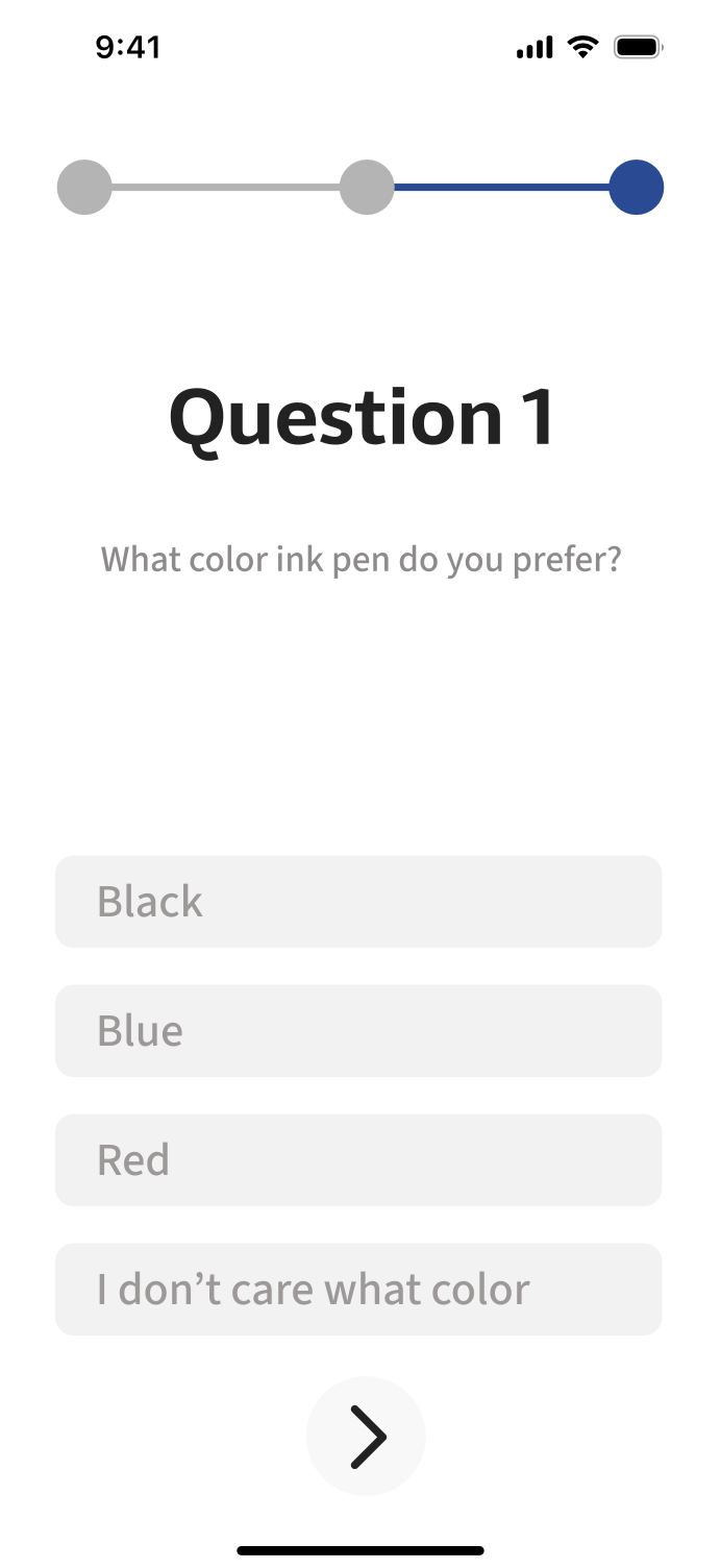
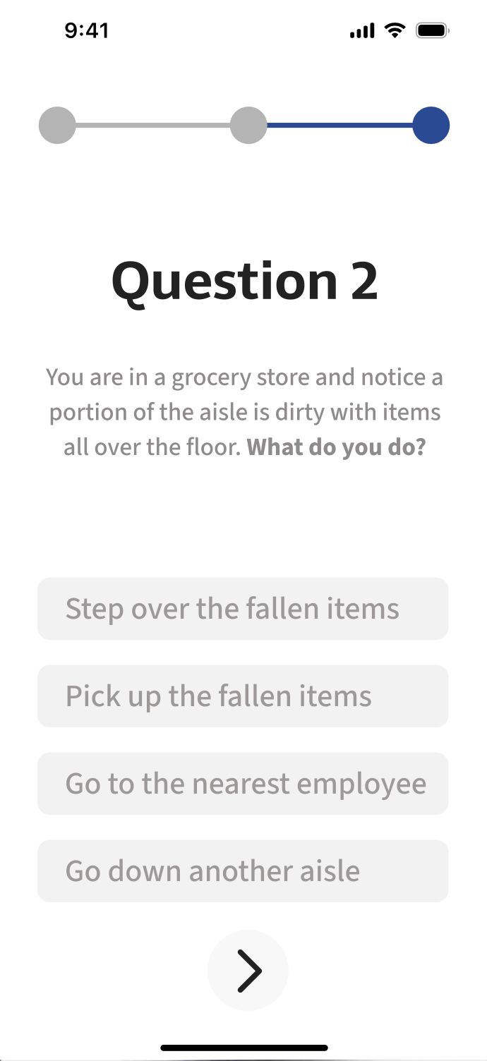
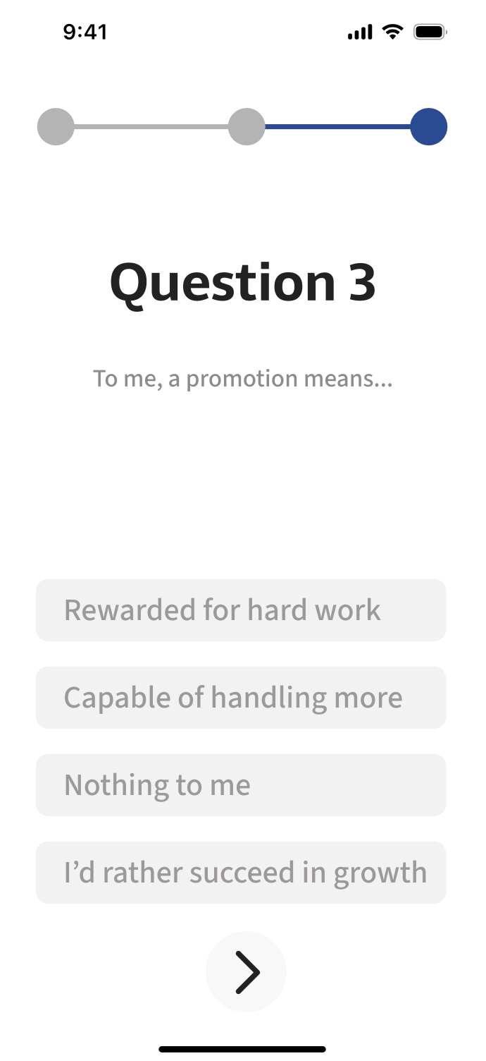
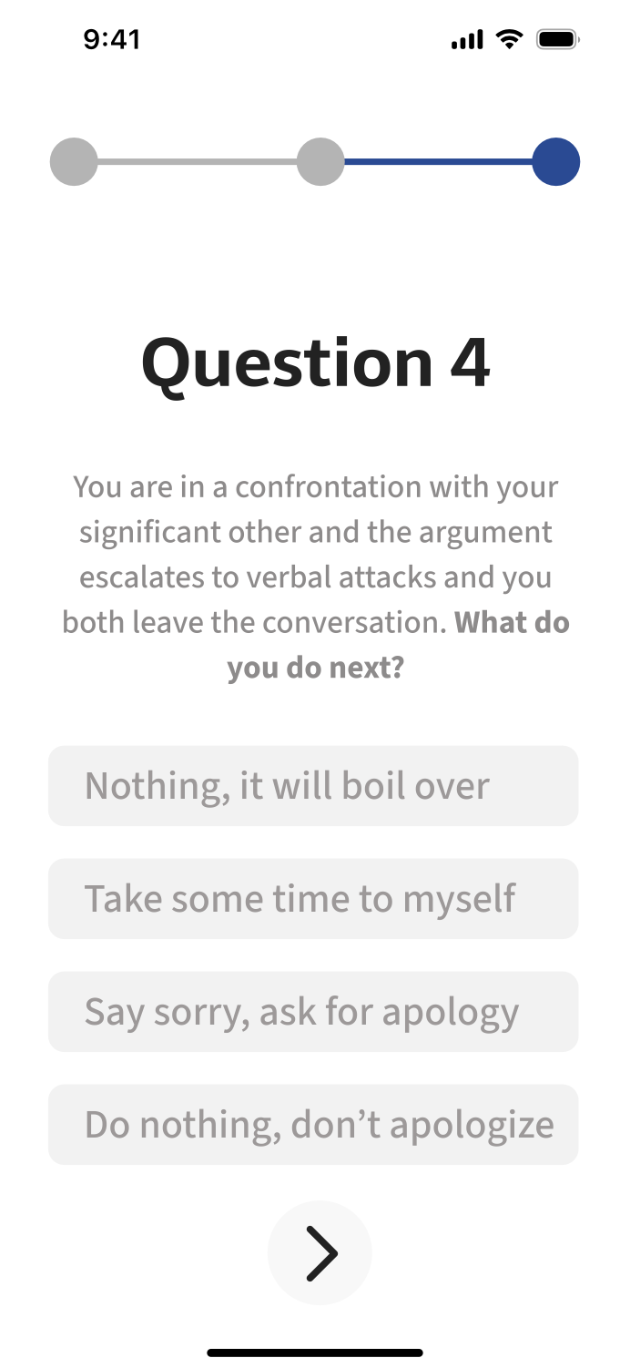
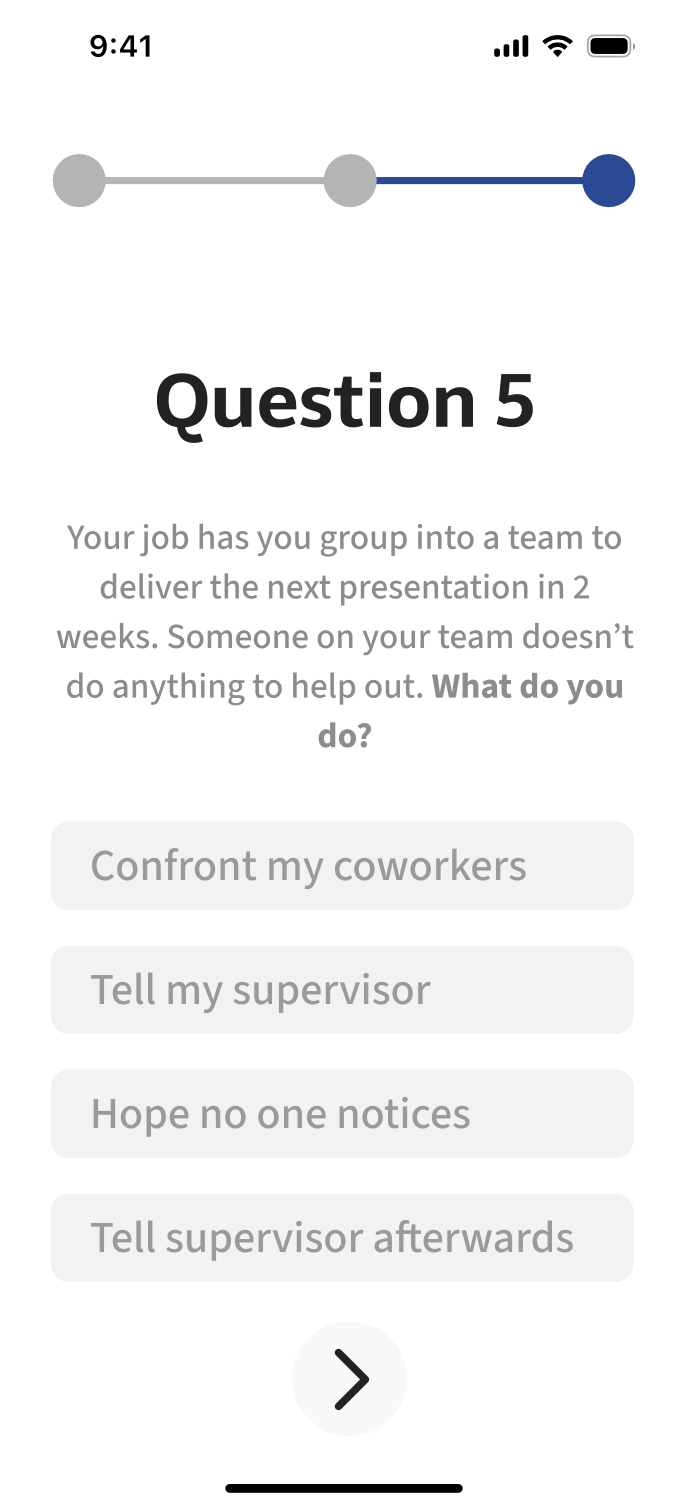
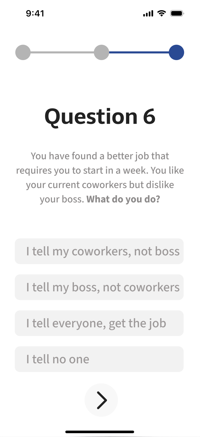
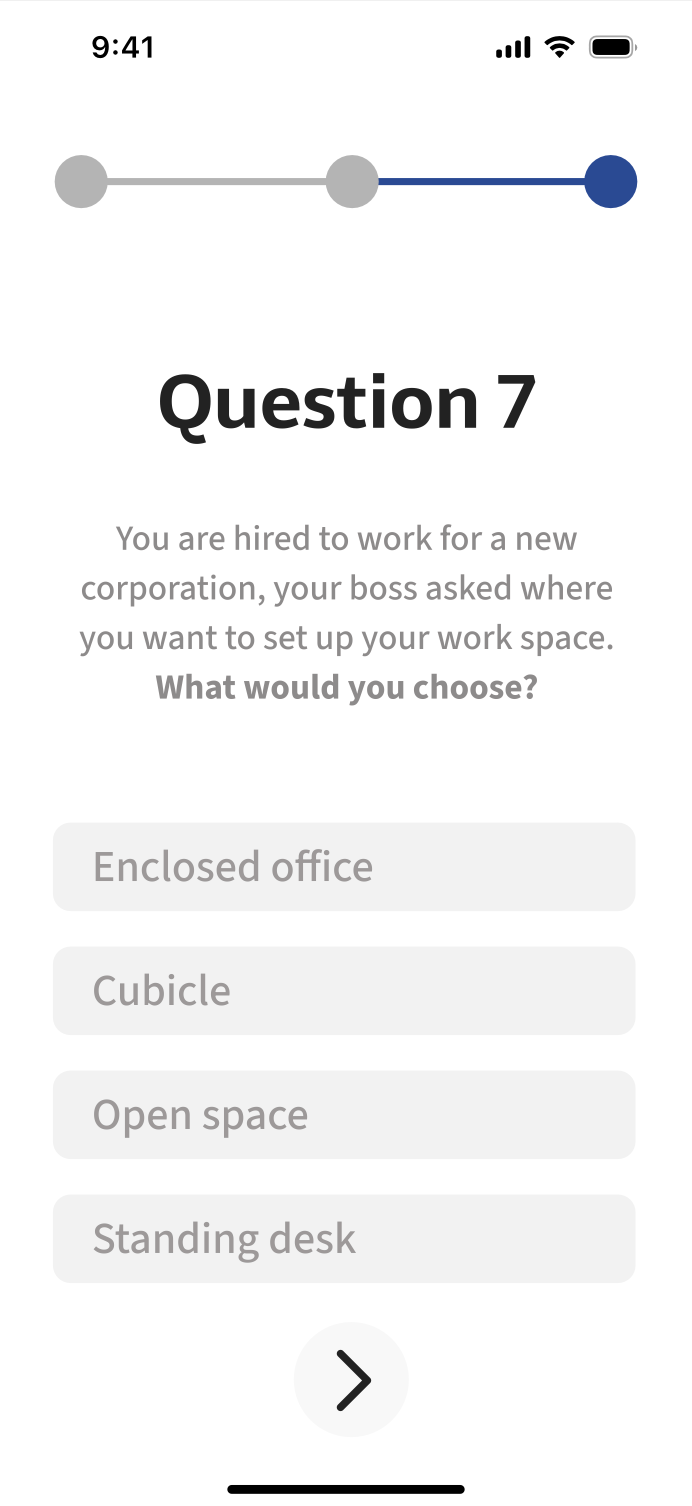
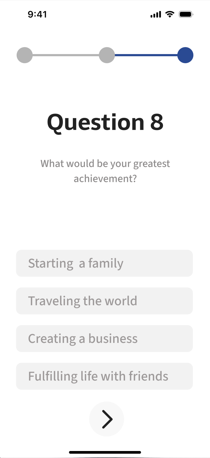
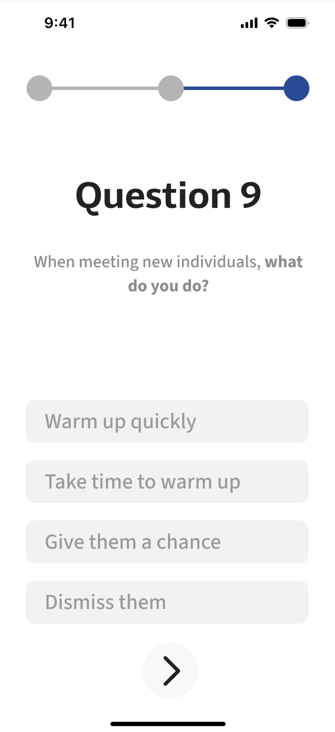
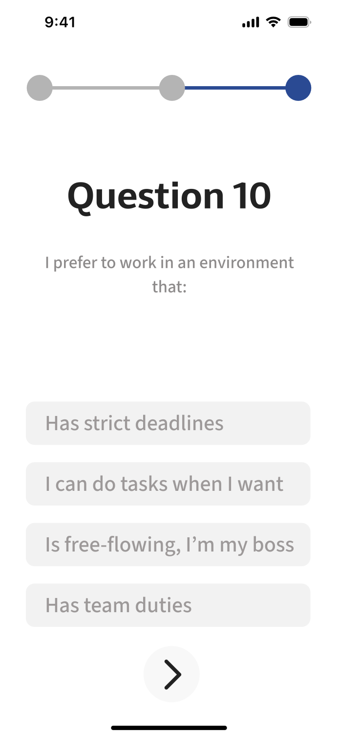
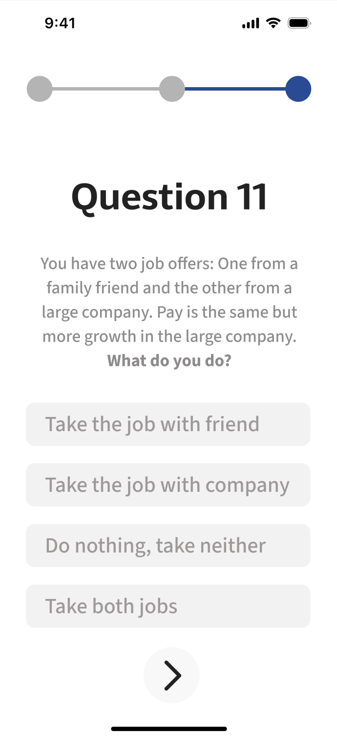
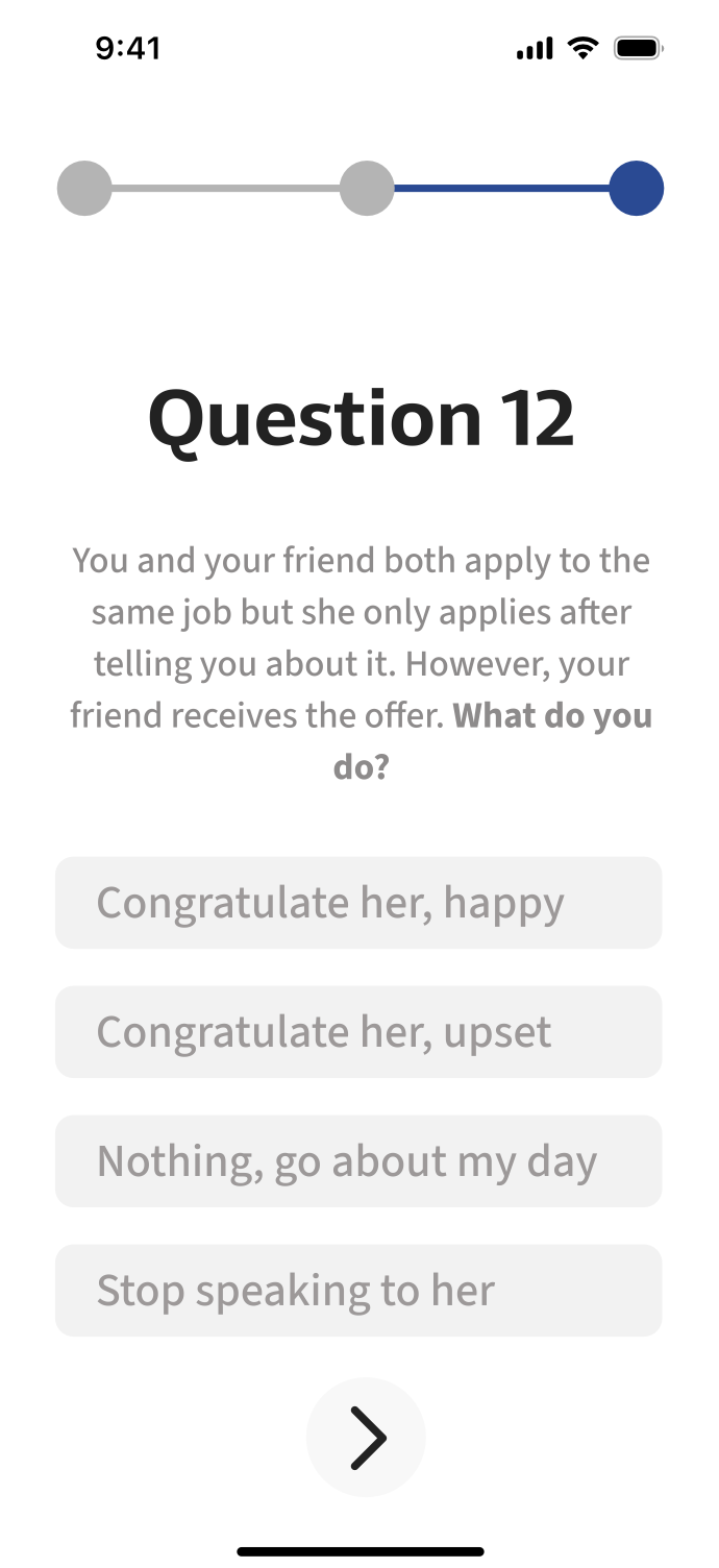
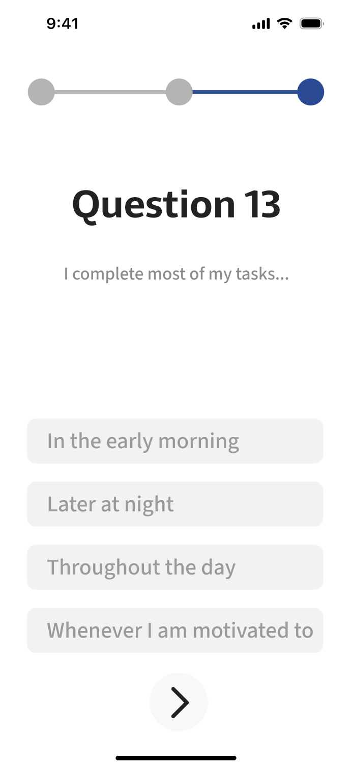
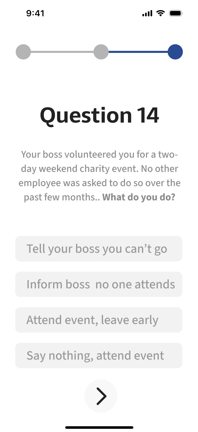
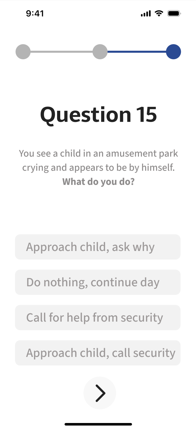
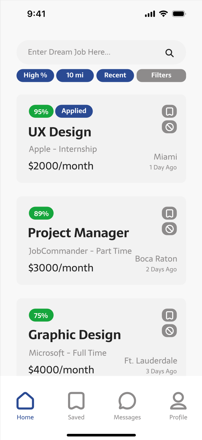
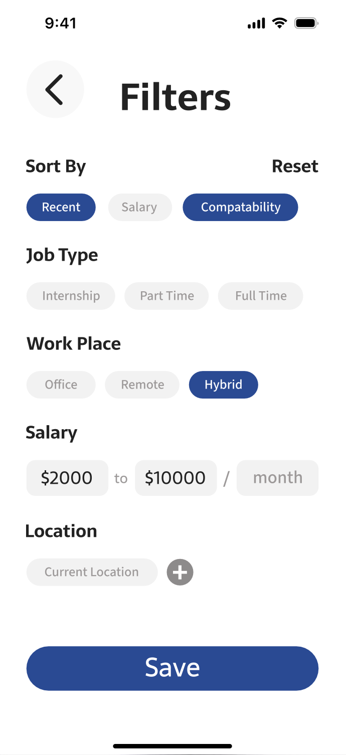
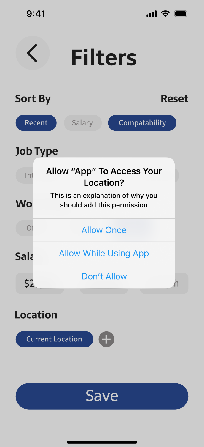
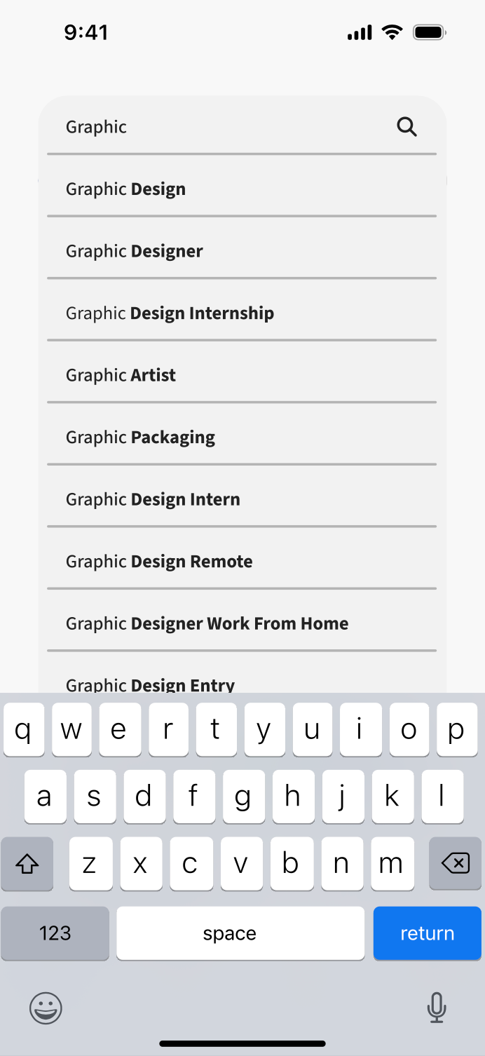
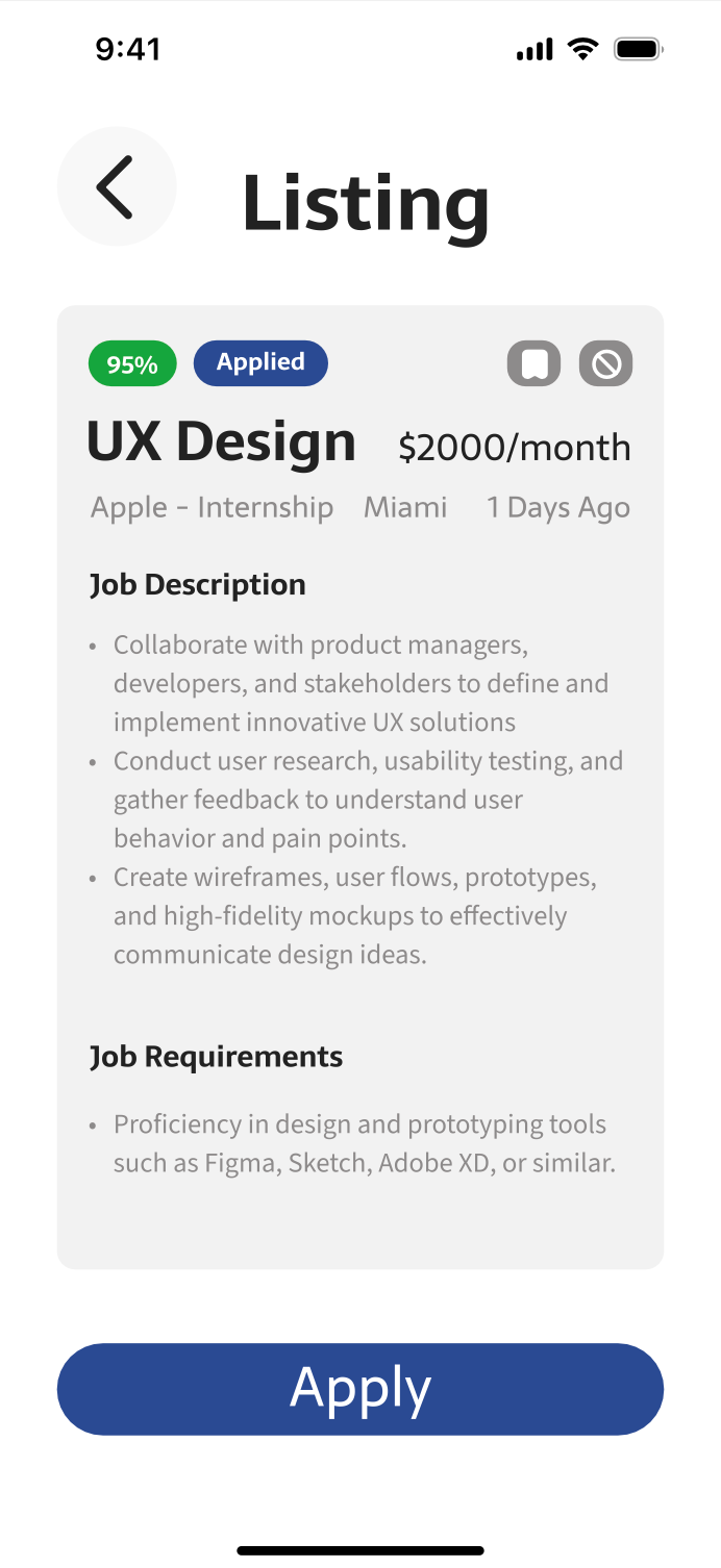
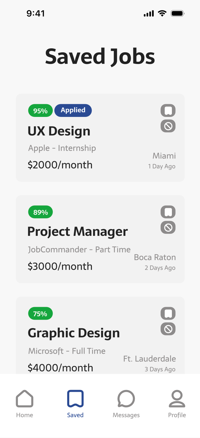
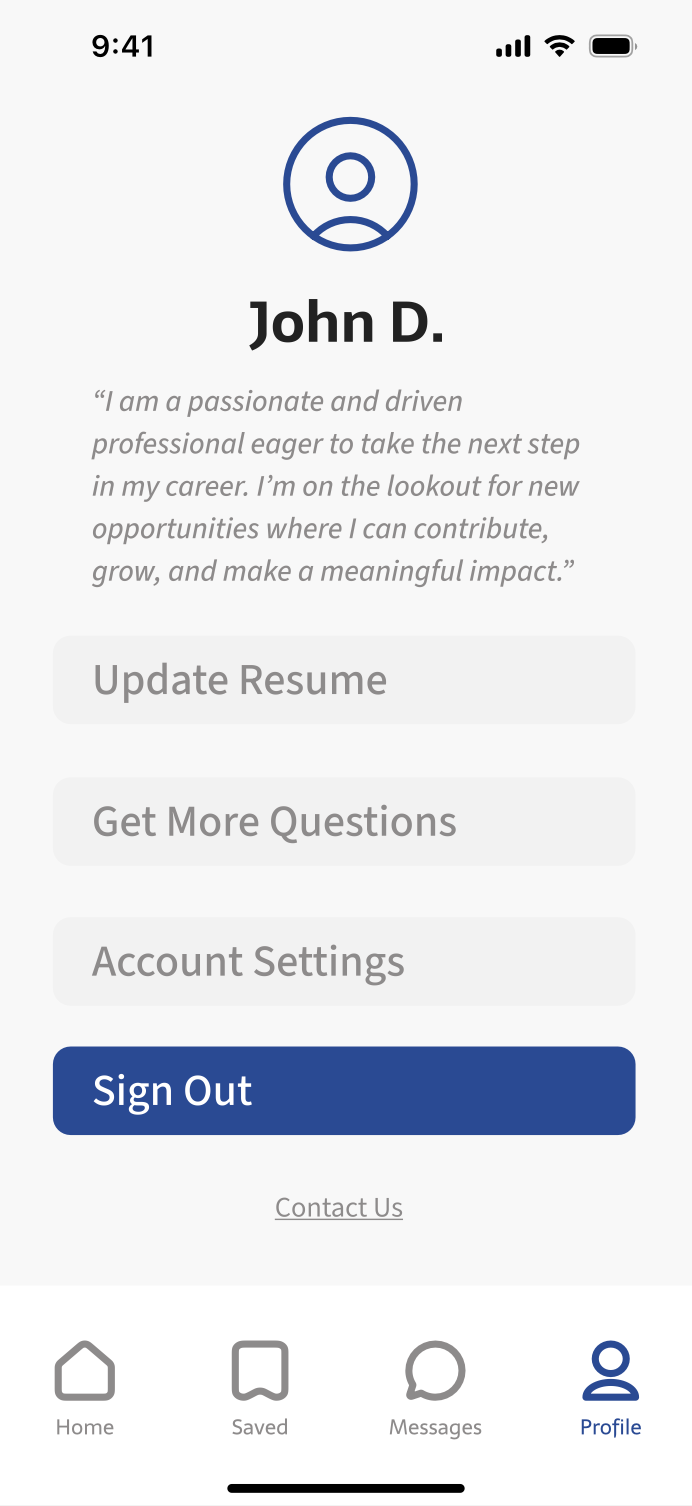
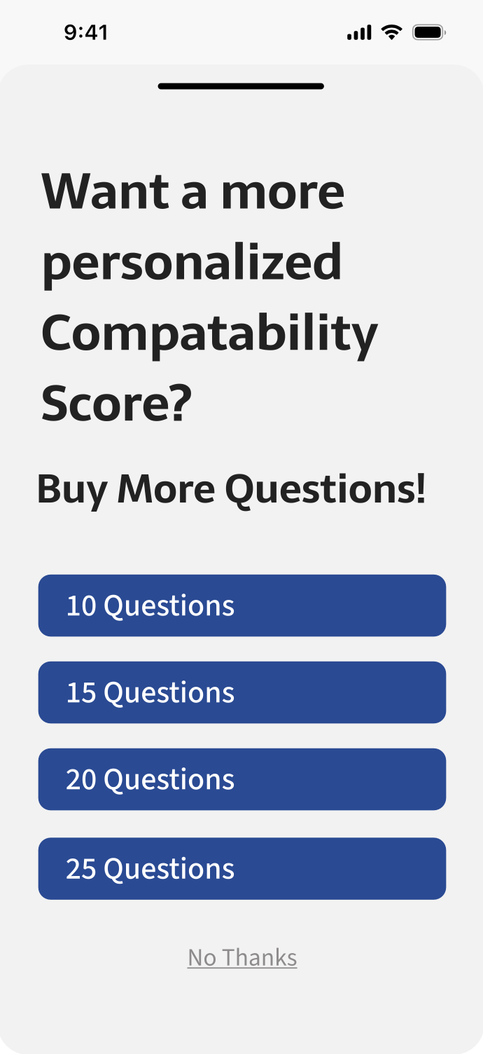
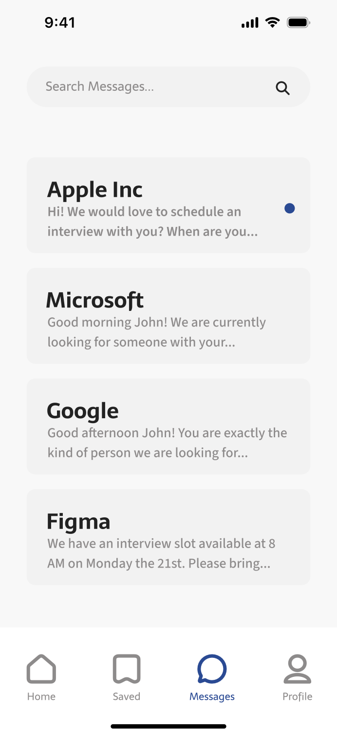
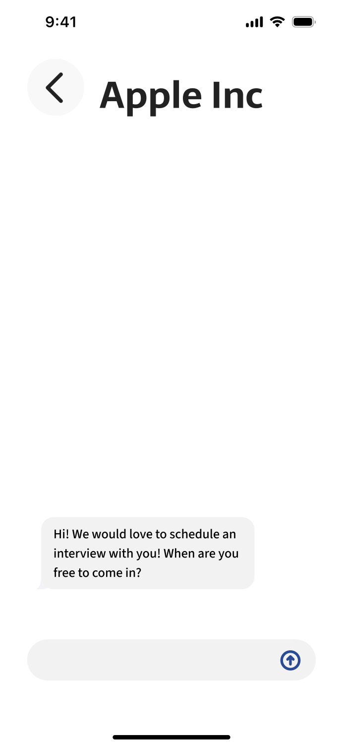
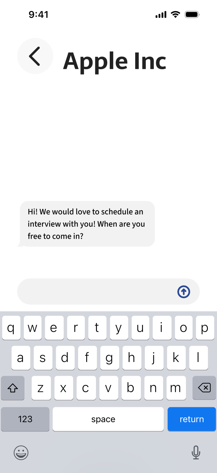
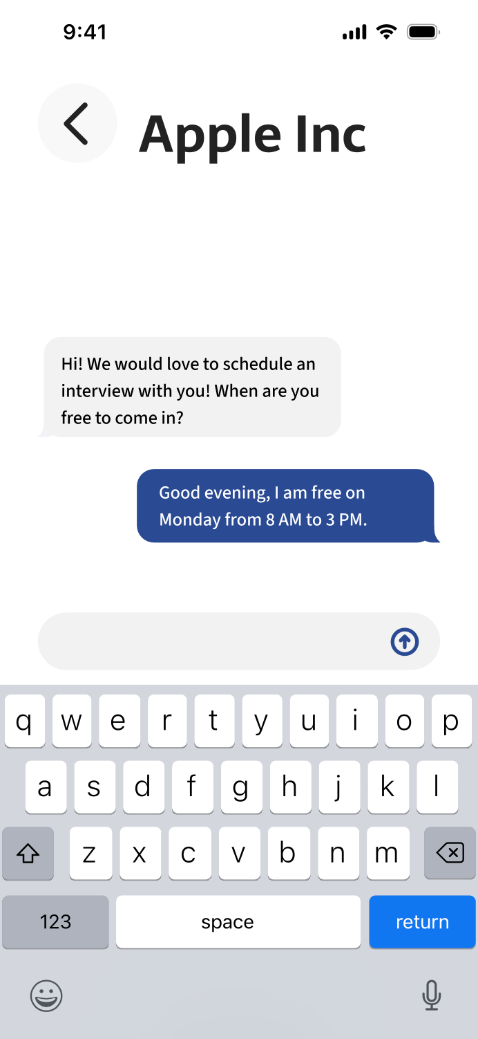
A job search application that allows users to upload information and answer fifteen questions to generate a compatibility score that evaluates alignment with available positions. Jobs can be searched from the top of the home screen or filtered using a wide range of criteria. The application includes an integrated messaging system that enables communication between employers and applicants. The color palette used was white, greys, black, blue, and green. This palette helps the blue and green stand out more when they are used minimally.
CASE STUDY
Challenge
Objective
To create a new interface for a job searching app/website that combats common user pain points.
Create a brand-new app and website for employers and job seekers that uses personality questions to better understand and match users.
Project Scope
Tools
Responsive New App, Responsive New Website, Problem Solving
Adobe Illustrator, Adobe Photoshop, Adobe Portfolio, Behance and Figma
Role
Team
Project Manager, UX Designer (Research, Visual Design, Interaction Design, User Testing)
Feedback from Classmates, JobCommander CEO and Outside Sourced Graphic Designers
Duration
4 Weeks
Design Process
Research
Research Goals
Research Assumptions
The goals are to better understand the users that normally use job finder apps and why they use it. We also want to find out more about our competitors and what gives us an edge over them/stand out in the marketplace. We’ll research the market itself and its future.
Some assumptions we made were that users would be young and inexperienced, looking for good pay. They would also expect a similar layout to popular job apps. Users would understand how to navigate without a tutorial based on clean UI/UX design, and they will look at the design and base legibility and popularity on it.
Market Research
AI learning is at the forefront of transforming job search apps.
User-centric design and functionality are crucial for the success of job search apps.
The job search app market is going to continue growing in upcoming years.
Demographics
Our audience is unemployed job seekers and employers for intern and entry-level positions.
Unemployed job seekers for intern and entry-level positions are around the age of 20–25, or recent graduates.
Gender of job seekers and employers are balanced.
User Behavior
Unemployed job seekers are actively looking for better roles or industry changes. They are also looking for employment after being laid off or leaving a job.
Around 59% of job seekers search daily for jobs on mobile apps.
The average job search takes around 5 months, showing us a significant time investment for users.
94% of recruitment professionals believe job searching apps have a positive impact on the hiring process.
The average number of applications to get a job is between 100–200 applications.
Competitive Research
LinkedIn
Indeed


Pros: Networking, professional presence
Cons: Too much content & ads
Cons: Too much content & ads
Pros: Simplicity, efficiency
Cons: Lacks networking, ad heavy
Cons: Lacks networking, ad heavy
ZipRecruiter
Monster

Pros: Streamlined, quick application process
Cons: Lacks networking, advanced filters
Cons: Lacks networking, advanced filters
Pros: Wealth of job listings & career tools
Cons: Outdated interface, ads
Cons: Outdated interface, ads
Verified Assumptions
We were correct to assume that users would expect a similar job seeker interface to our popular competitors for ease of understanding how to navigate without a tutorial.
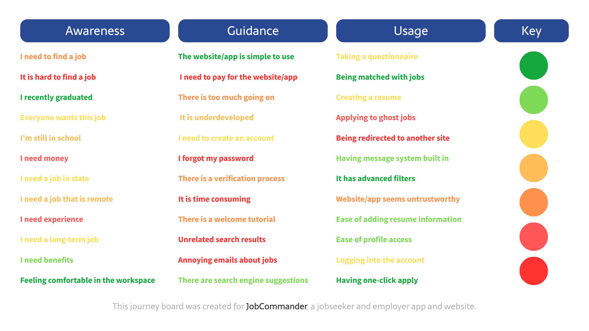
Journey Map
Insights
Needs
After creating this journey map we were able to better understand what our audience experiences while using these job seeker apps and what we need to focus on improving.
We were able to figure out that most users would want a more personalized job seeker app and don't want to have to deal with complications such as being ghosted by jobs and being redirected to their sites and having to make new accounts that are unnecessary. We will combat this by having questions to match based on personality compatibility so you will be just what that job is looking for! We also will offer having set timers for job listings and responses so you will always have an answer no matter if it's a yes or no. We also will be implementing an in-app messaging system were you will be able to communicate with employers.
User Personas
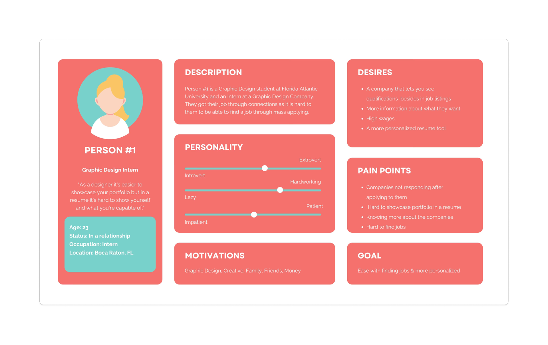
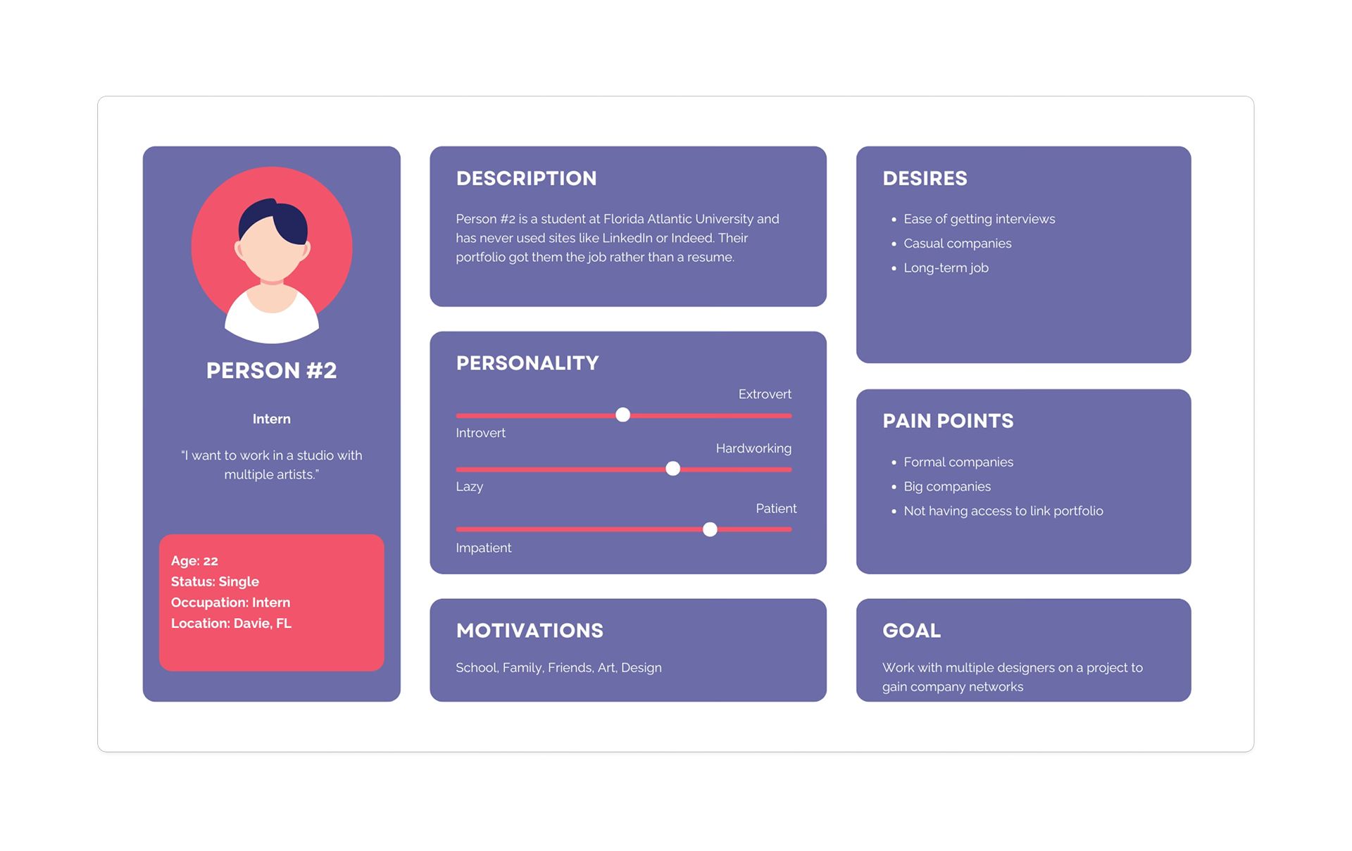
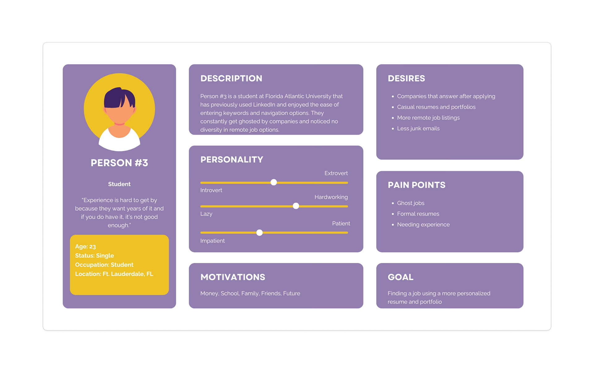
By using User Personas we are able to better understand our audience and what their goals and pain points include of. We were able to determine the biggest pain point in these users were competition in finding jobs and being ghosted.
Product Goals
My project goals are to create a new job seeker app environment on the market that will focus on matching you to jobs looking for those traits, minimizing the amount of competition you will have trying to find a job.
User Flows
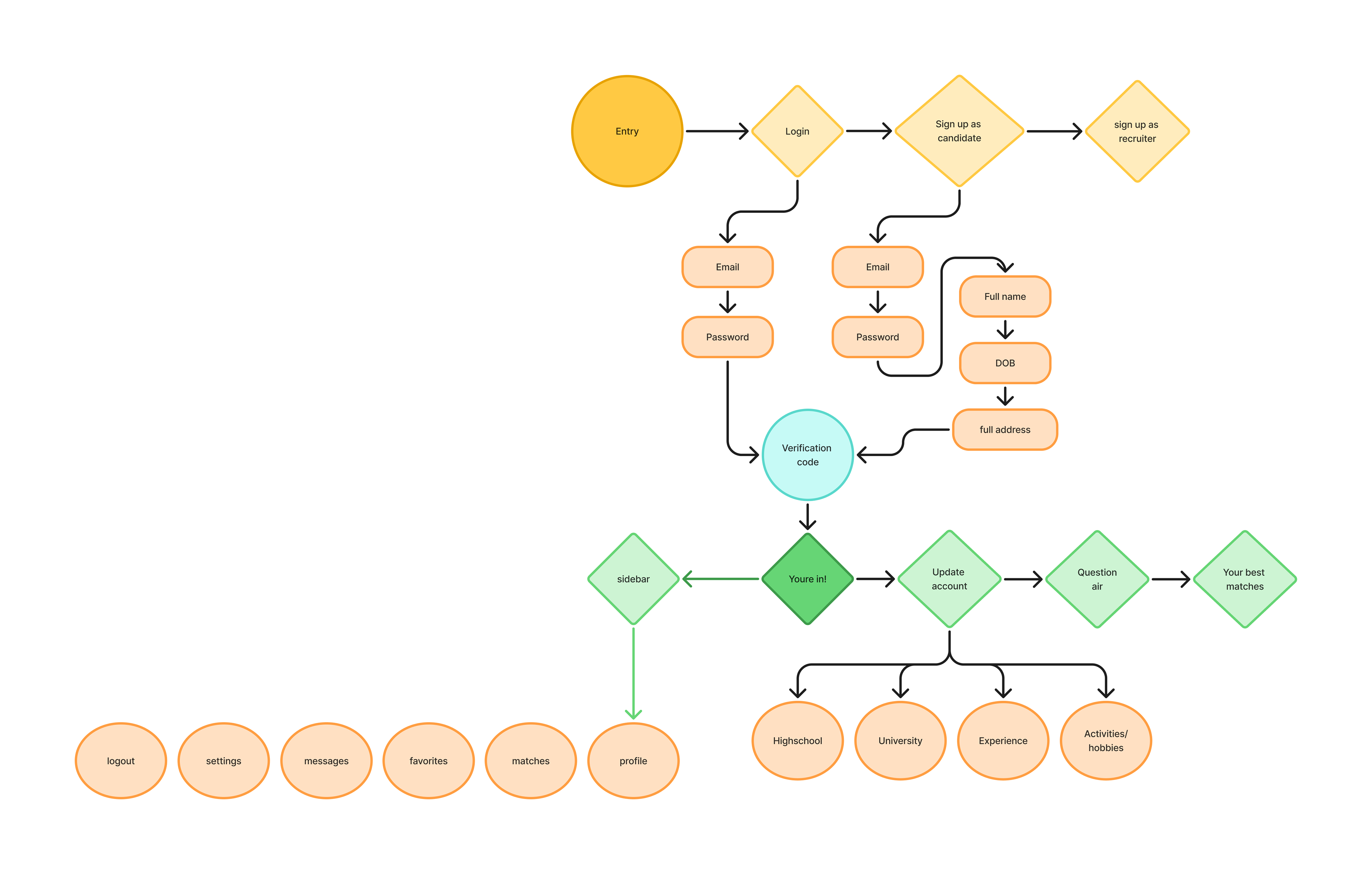
App User Flow
This user flowchart shows the process in which a user would interact with the JobCommander app from logging in and creating an account and the options you would see.
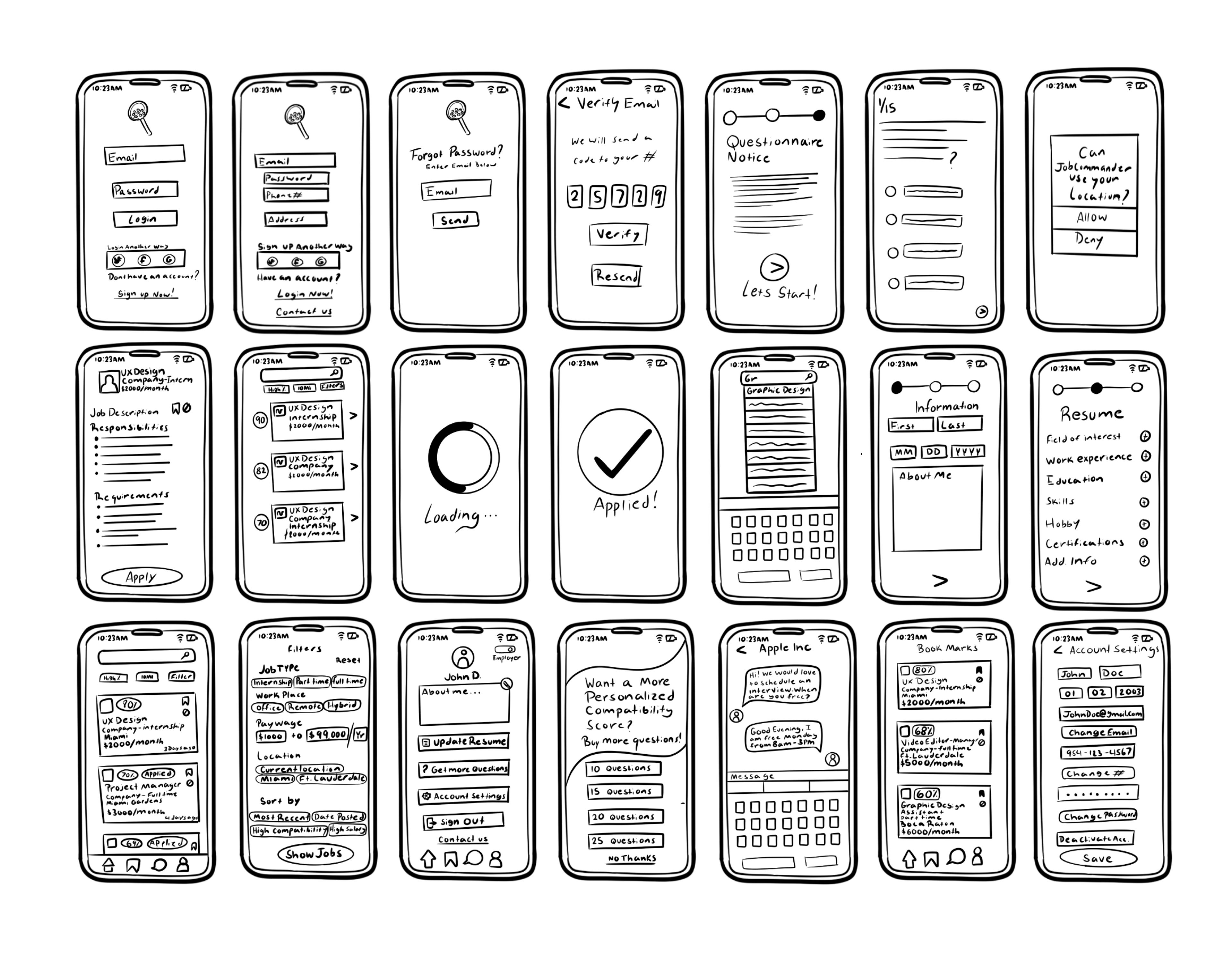
Paper Prototypes
Mid-Fidelity Paper Prototype
These sketches show some of the possible screens our users will encounter on our app. There is a sign up and login screen option that can be changed depending on the user and if they have used the app before. If you don't remember your password, we have a screen for that where you can enter your email to send a password link. We also will incorporate an iOS keyboard pop up for codes and typing in search bars or messaging an employer. Some screens are not included in these sketches due to simple changes in similar screens that will later be duplicated and changed accordingly to the type of user.
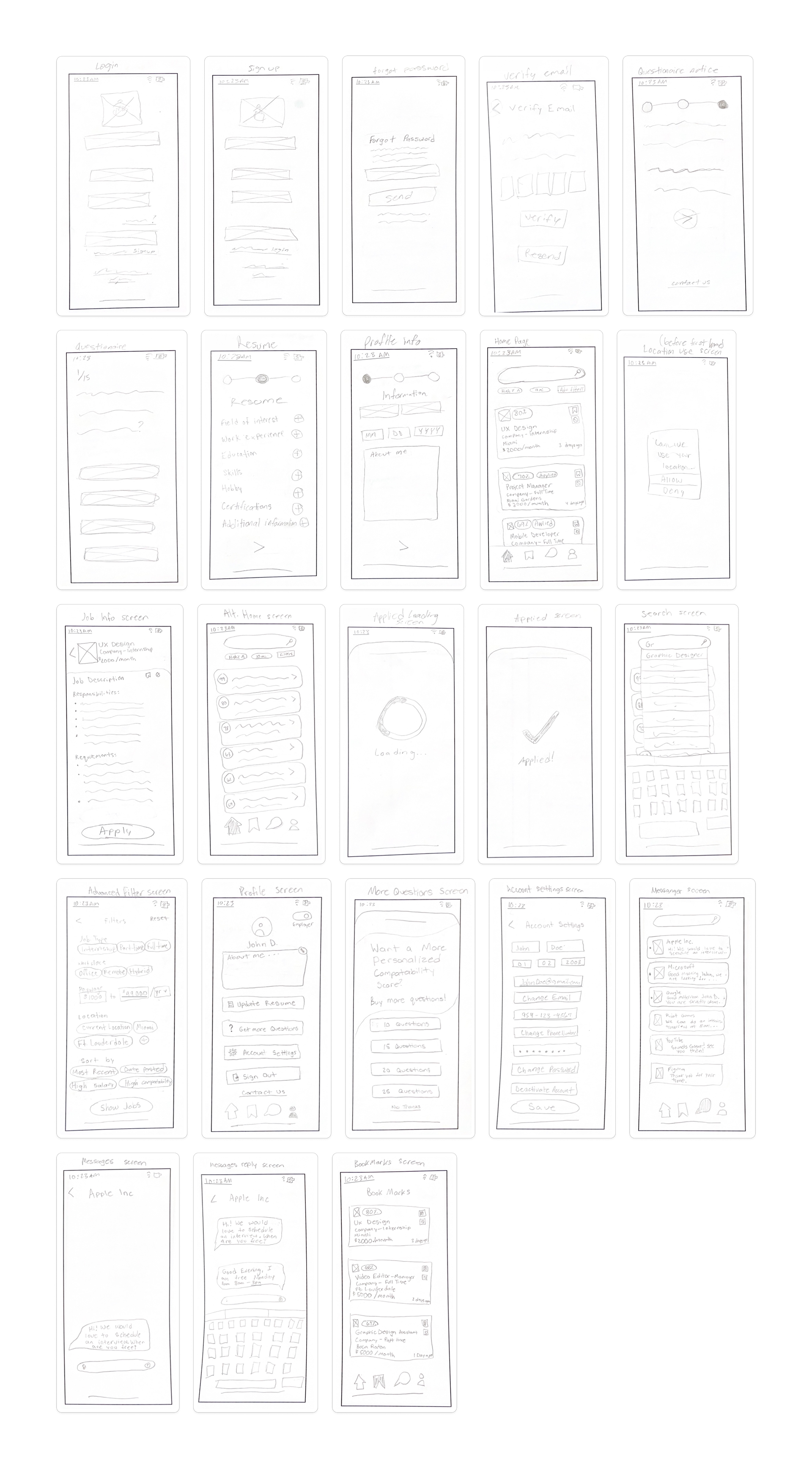
High-Fidelity Paper Prototype
Our high-fidelity app sketches show a more cleaned up version of the previous app sketches. This gives us a better look at how it will look all put together.
Feedback
We have received feedback on our design process by some outside source graphic designers that we know as well as our professor. We were told to remove the icons off the app due to users already knowing they are in the app and to look in to other color palette options and what we can do with the two colors we were already provided through the JobCommander style guide.
Color Palette

This color palette incorporates the primary green and blue dark shades used in the logo and style guide. We have added a pure white and off black color to add more contrast in our work as well as some grey tones to complement the strong contrast.
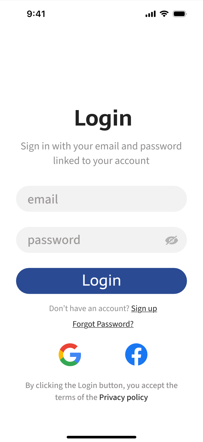
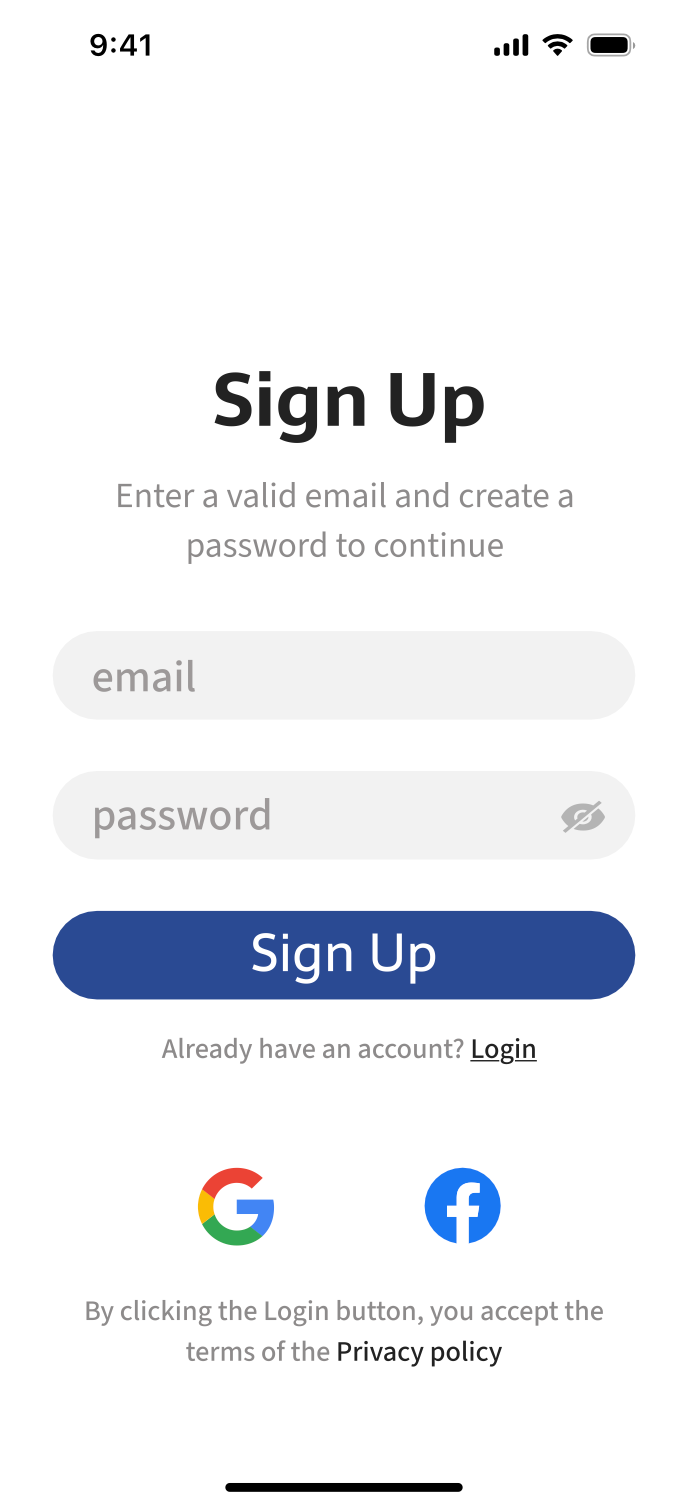
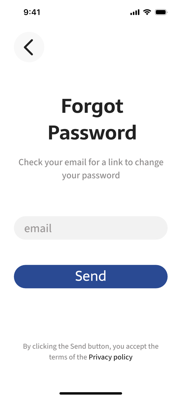
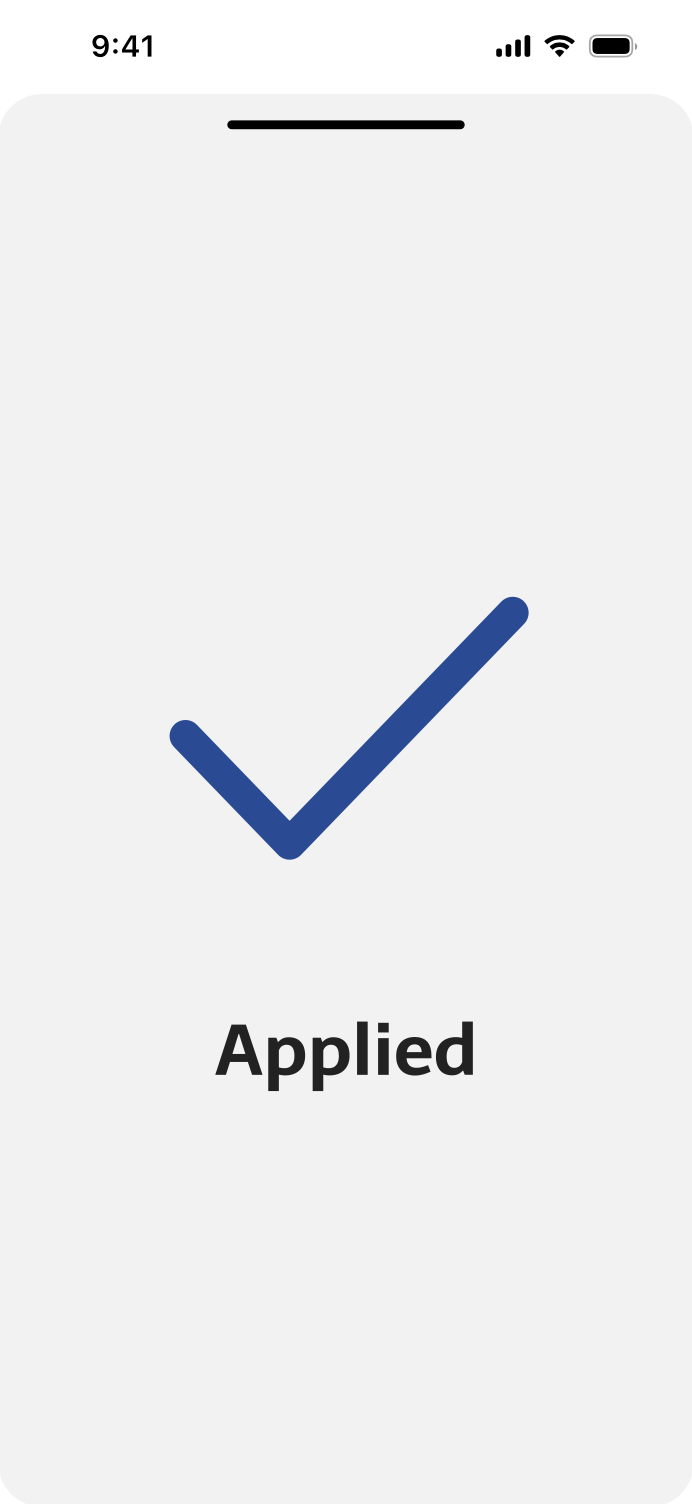
Completed App
Final Thoughts
Considering the time frame to complete this project, I think we did a great job, completed our goal, and overcame our challenge. This prototype conveyed exactly what we wanted it too.
Next Step
Our next step would be to send this to a developer to be functional and published onto app store platforms. If we continue to work with JobCommander after this project, we will continue to make high quality graphics for their brand.