GradPool App
Interactive Design, Responsive
2556 x 1179 pixels
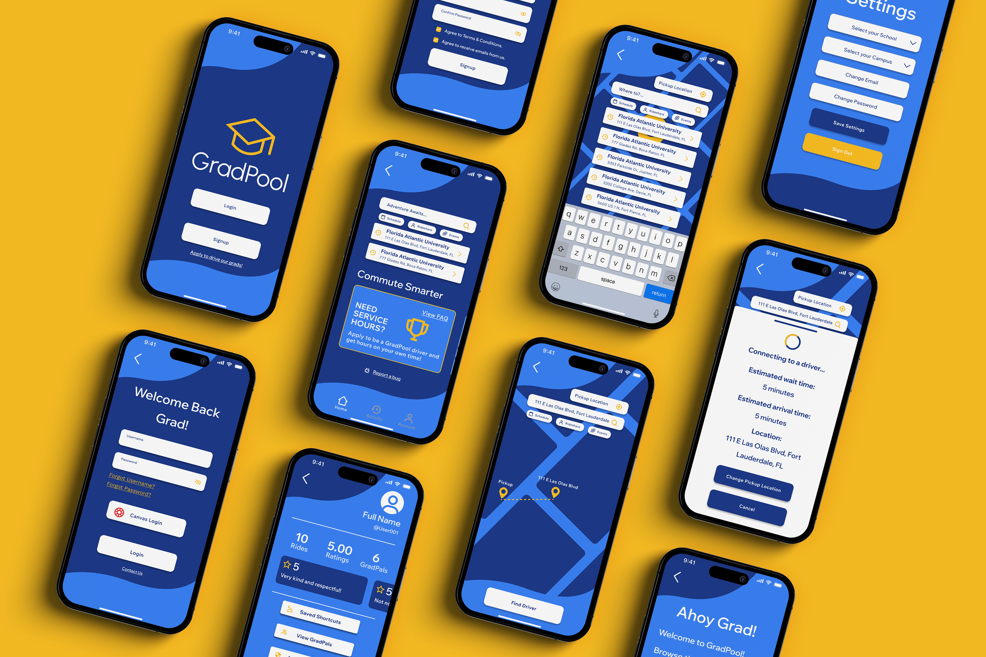
A tuition-supported application that helps students without transportation get to school through student carpools. The application features a rating system for drivers as well as a ‘GradPals’ friends list to ride-share with friends to campus. GradPool is a portmanteau of the words graduation and carpool. Organic wave elements reference the double meaning of the word pool, while grad is shown through the graduation cap logo. The color choice uses bright and fun colors including calm ocean blues and vibrant warm yellow to appeal to college students.
Case Study
Challenge
Objectives
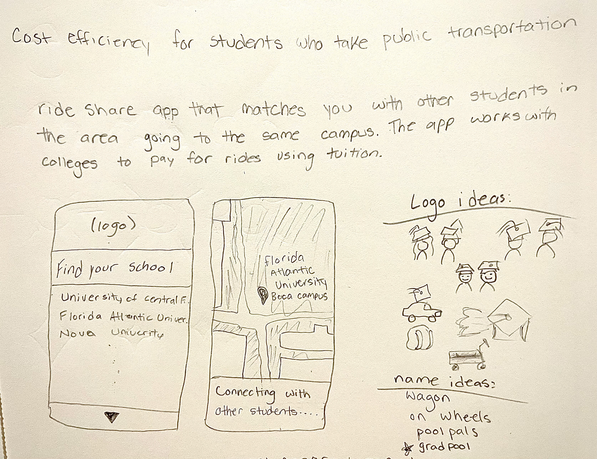
I am creating an app for students to help with the commute to school and its pain points. I have created an app called GradPool that is by students for students. GradPool would work hand and hand with schools to be free for students to use as it would be covered by transportation fees in tuition.
Create a carpooling app for students that is easy to navigate. The app will focus on cost efficiency and help combat pain points of unreliable and public transport.
Project Scope
Tools
Responsive App, Problem Solving
Adobe Illustrator, Adobe Photoshop, Figma
Role
Team
UX Designer (Research, Visual Design, Interaction Design, User Testing)
Self Directed with feedback from class and outside sourced graphic designers
Duration
8 Weeks
Design Process
Research
Research Goals
Research Assumptions
My research goals are to be able to understand the users that will be using a carpool app and why. I also want to do extensive research on carpool competitors and compared what makes us stand out from them on the marketplace as well as research on the market itself and its future in today's world.
An assumption I made about the users would be that they are expecting a similar layout to other carpool apps due to popular brands like Uber. Another would be that the users wouldn't need certain texts to describe what page they are on due to modern usage of icons with the same meaning. Users also would judge the UX design of the app to verify quality and safety which may impact total downloads, usage and ratings.
Market Research
The carpooling market is projected to keep rising in the next upcoming years.
Many carpool companies are starting to work with autonomous cars such as Uber and Lyft.
Eco-friendly rides are being promoted more due to an increase in environmental awareness and carbon emission.
Educational institutions such as colleges are starting to adopt carpooling for transportation because of a decrease in bus service.
Further expansion into new areas that have limited access to carpool.
Carpool apps are integrating AI tools to help ease access to connect to drivers.
School buses are having a shortage in bus drivers making it now less reliable.
Demographics
The primary user of carpool apps are aged 18-29 years old.
Users who are students in college are most likely to use carpools.
Urban residents use the app more due to higher availability in drivers.
Gender of carpooling users are balanced.
User Behavior
Users found popular driving service apps to be price gouging though a multitude of fees and fluctuating pricing in busy hours.
An increase in fluctuating pricing can result in a 60%-80% drop in users as time goes on.
Users want affordable carpooling in this economy.
30%-50% of users will carpool again if they had a great experience.
Regular carpoolers for school have a 20%-40% weekly return rate.
Competitive Research
Uber
Lyft
Uber has strengths in user-friendly design, safety through verification for drivers, and has an environmental impact by reducing cars on the road. Their weaknesses include of trust concerns from riding with strangers, inconsistent pricing and high fees for each trip, and lacking design consistency from different devices.
Lyft has a similar strength in user-friendly design as well as carbon neutral carpool options and bonus incentives for drivers. Their weaknesses would be limited availability in not as populated areas, surge pricing during peak hours such as rush hour, and longer wait times and detours.
Verified Assumptions
User ratings were found to be lower on underdeveloped UX design and interaction apps. These also had significantly less downloads by the thousands. Users do not need text to understand certain icons mean the same thing such as the home button being a house icon.
Map & POV Statements
Insights
Needs
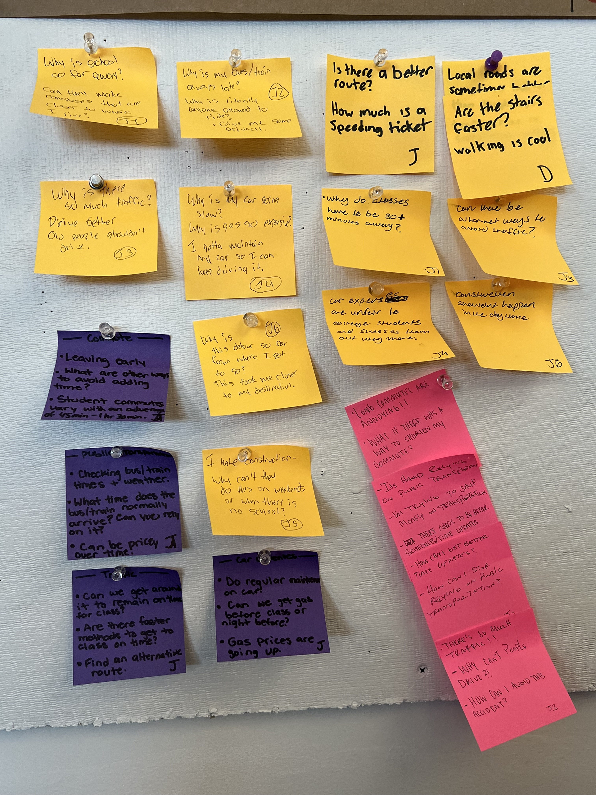
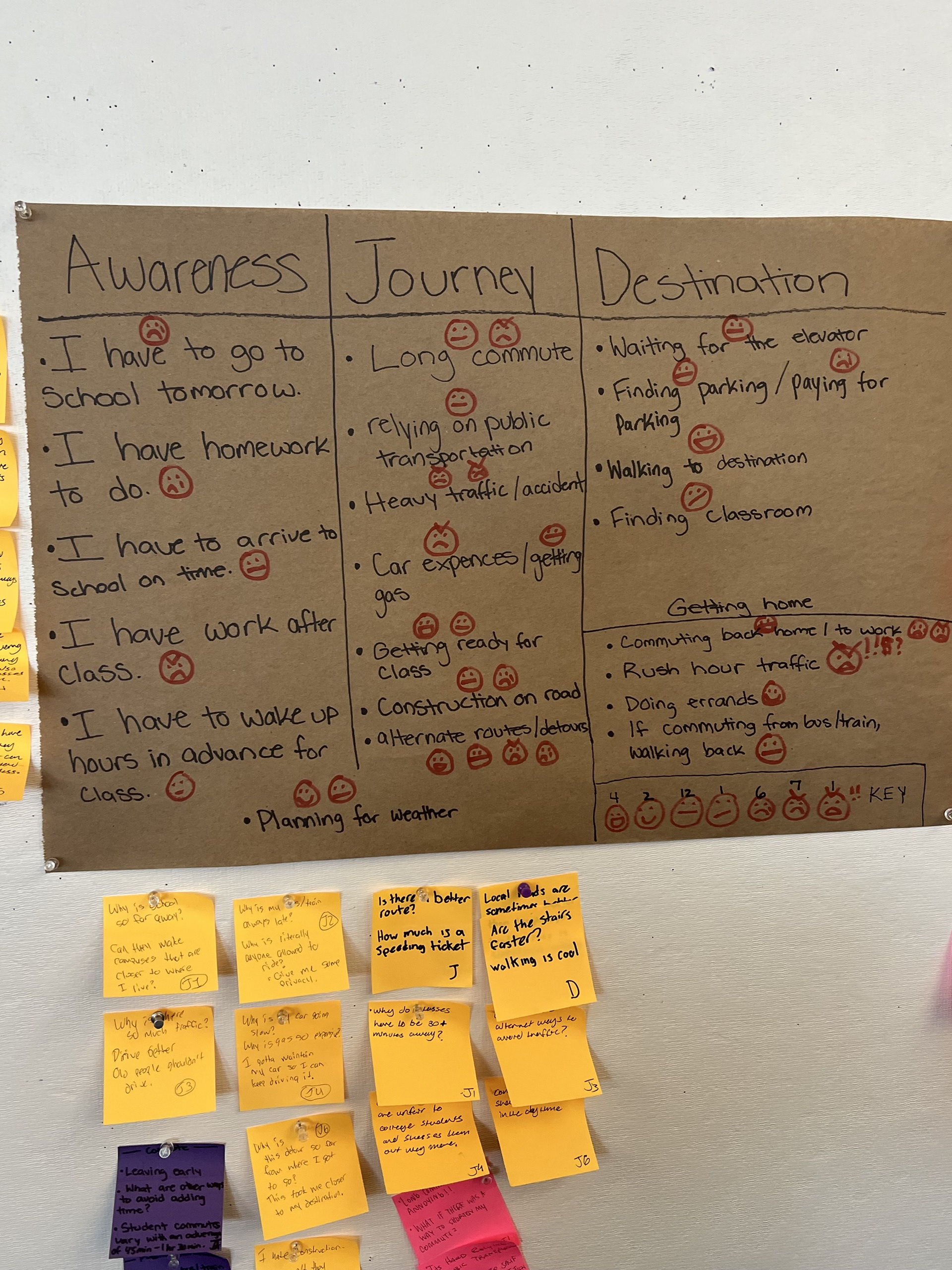
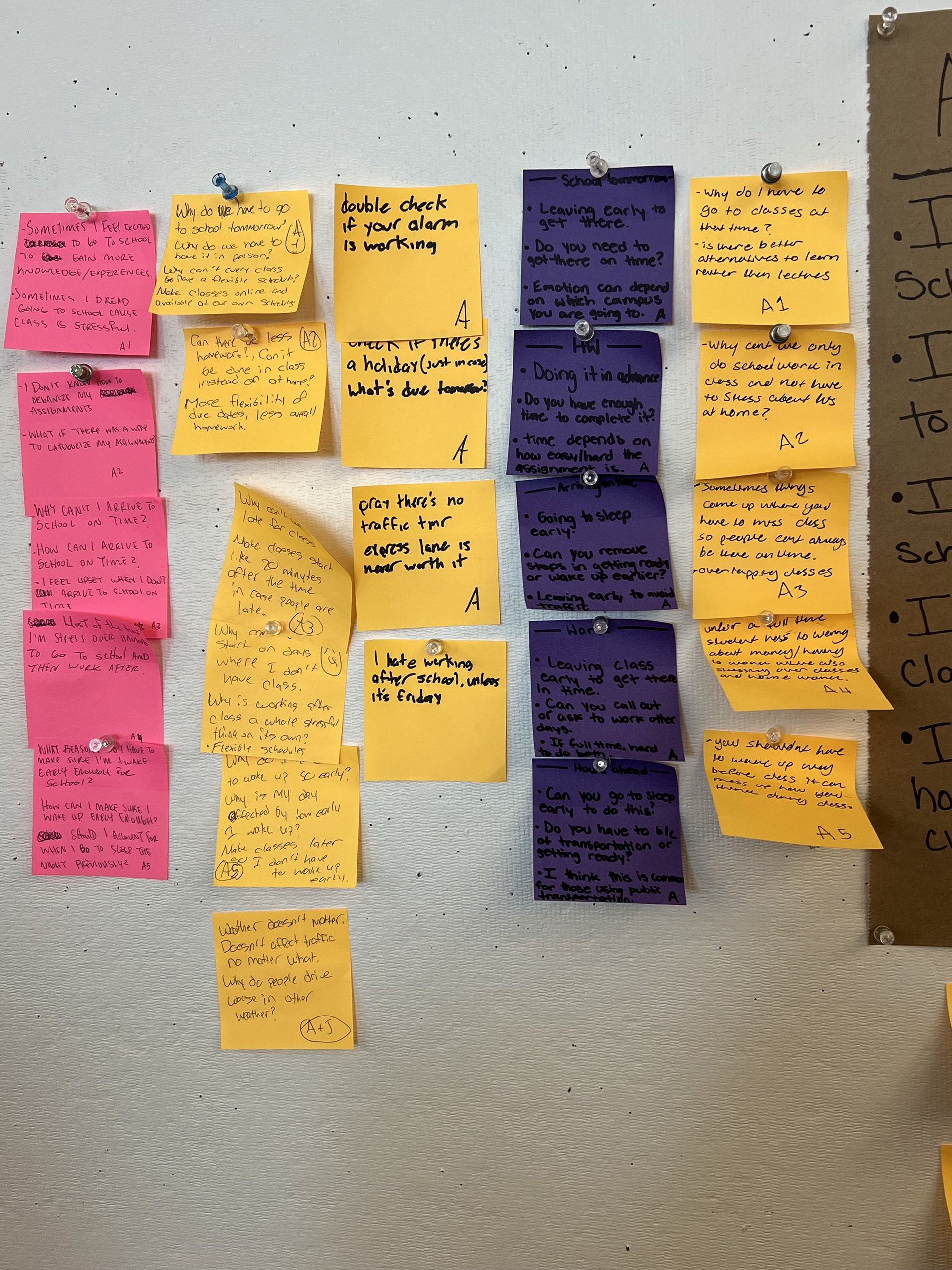
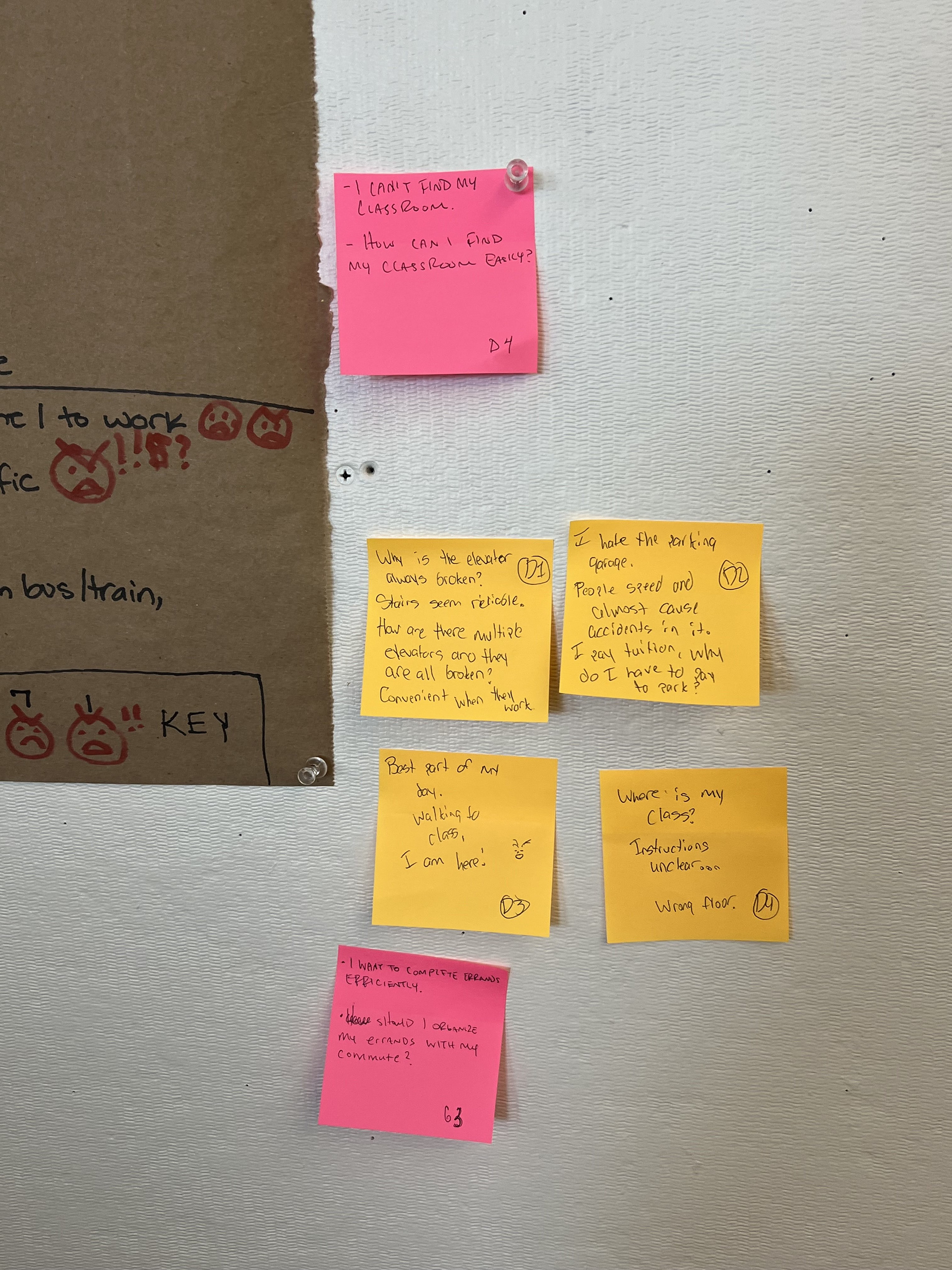
By creating this map with fellow classmates also working on a solution for commuting to class, we gathered information on the average school day for a student. This day includes of their awareness, journey, and destination thinking and tasks. We used sticky notes to give POV statements to understand how the student might think and our questions to further elaborate on each point.
We had come to the conclusion that the average student would find car expenses such as maintenance and gas, detours, the commute back home to be the most annoying and aggravating. We would need to find a solution that gets rid of the expenses and gets you to and from school on time.
User Personas
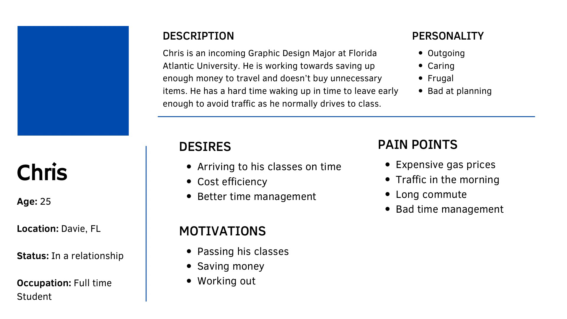
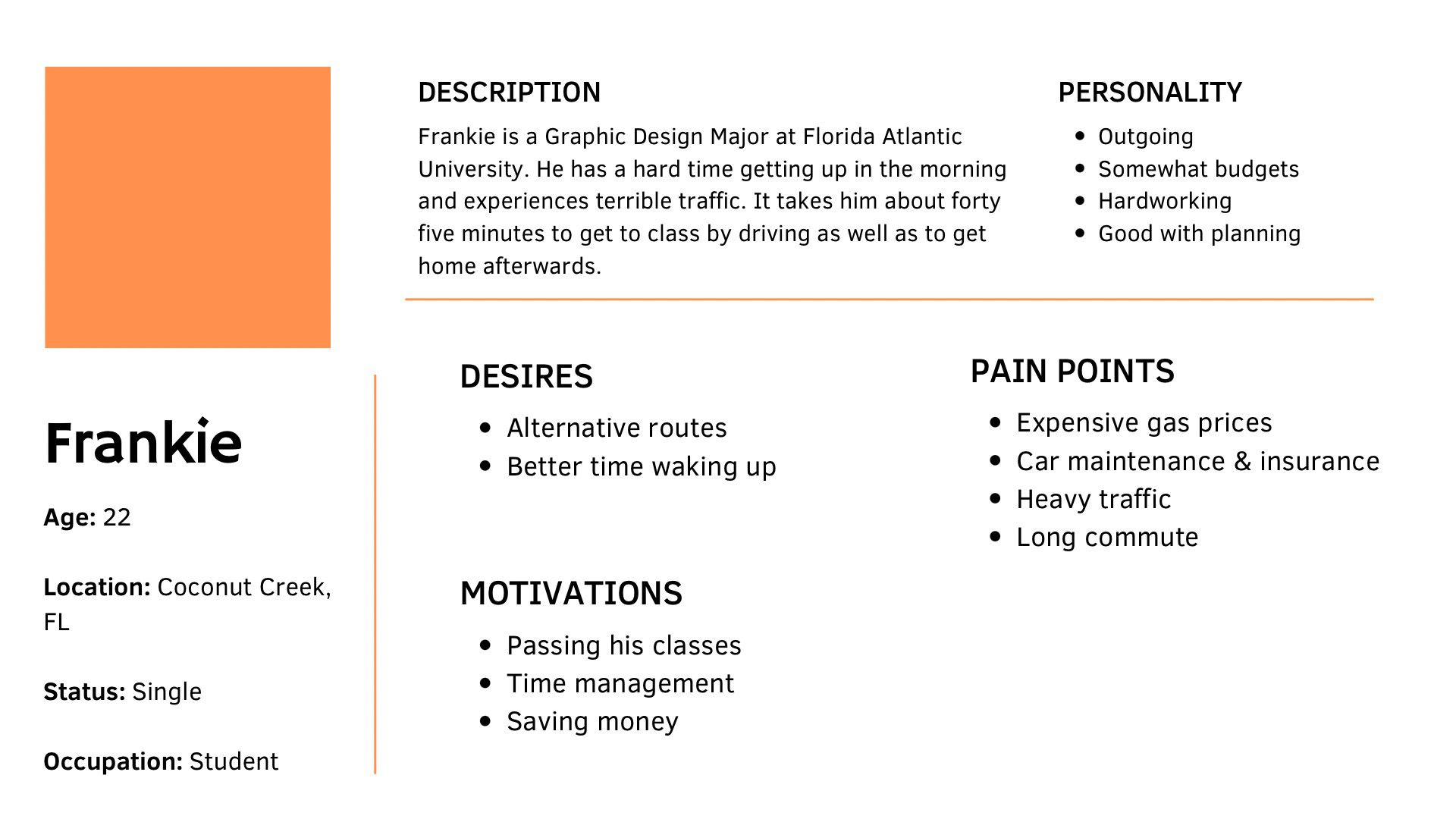
By using User Personas I can remember what I need to focus on while working on this project. Both of these users have similar pain points that I would like to lean towards such as expensive pricing in transportation and the long commute to campus and back due to their locations. After further elaboration, Chris had mentioned he had tried taking the bus before and it made the long commute longer due to frequent stops. He also had to pay to get to class and back and to do that everyday starts to add up for him since he is frugal. By being able to provide an app with free transportation and less frequent stops, I would be able to help both of the users in terms of saving money and time.
Product Goals
My project goals are to provide transportation for students with cost efficiency in mind due to heavy car expenses and some campuses being far away from each other. I also want to provide a clean and simple layout for ease of use for students using GradPool.
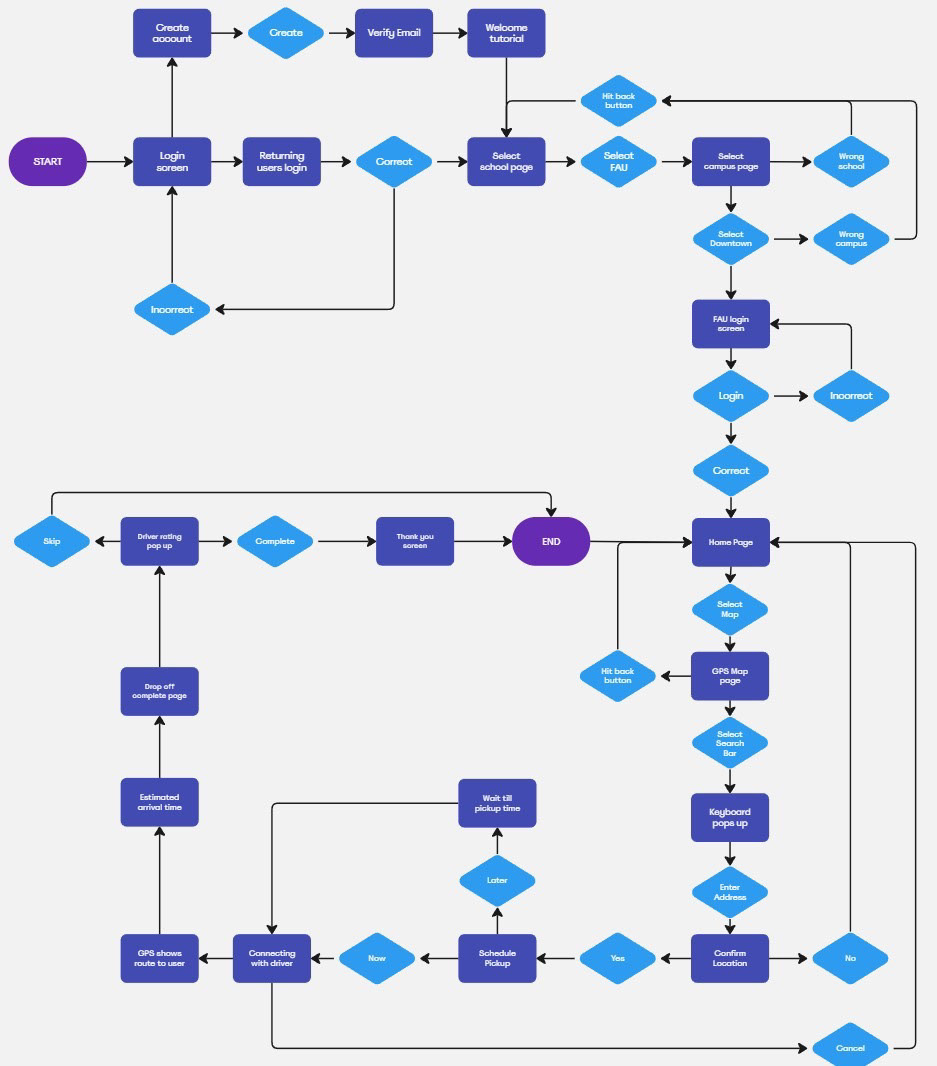
User Flowchart
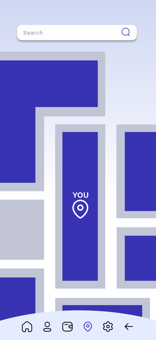
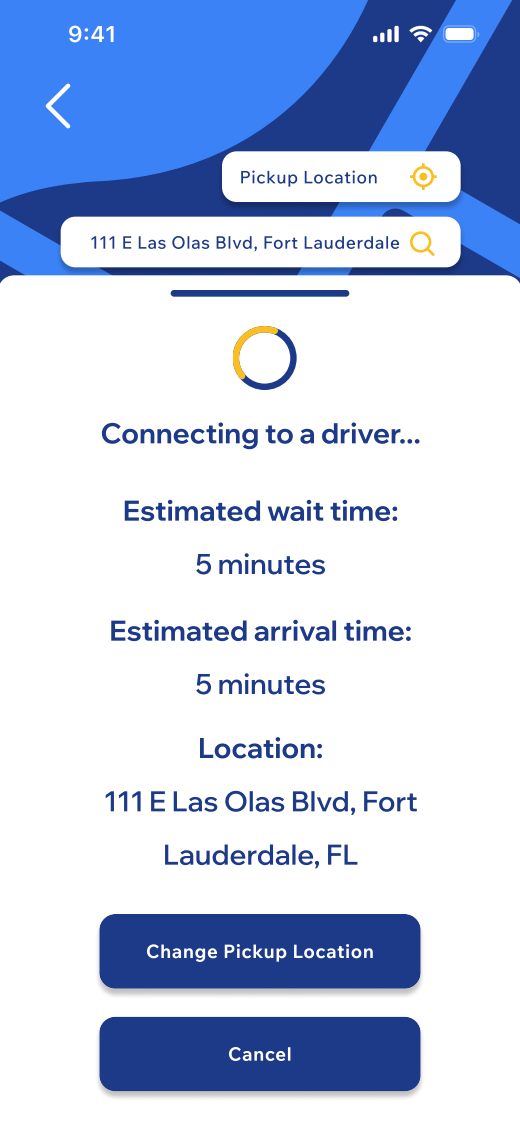
This user flowchart shows the process in which the app open in. As soon as the app is opened you will be led to a login and signup screen where you would then decide from them if you want to create an account and watch a tutorial, or login if you already made an account and go straight to the school selection screen. After that you would be lead to the home page where you can access the map and connect with a driver for your next journey. The flowchart ends after you decide to rate the driver and brings the user back to the home page. There are tons of side actions where you can always go back to the last page you were on.
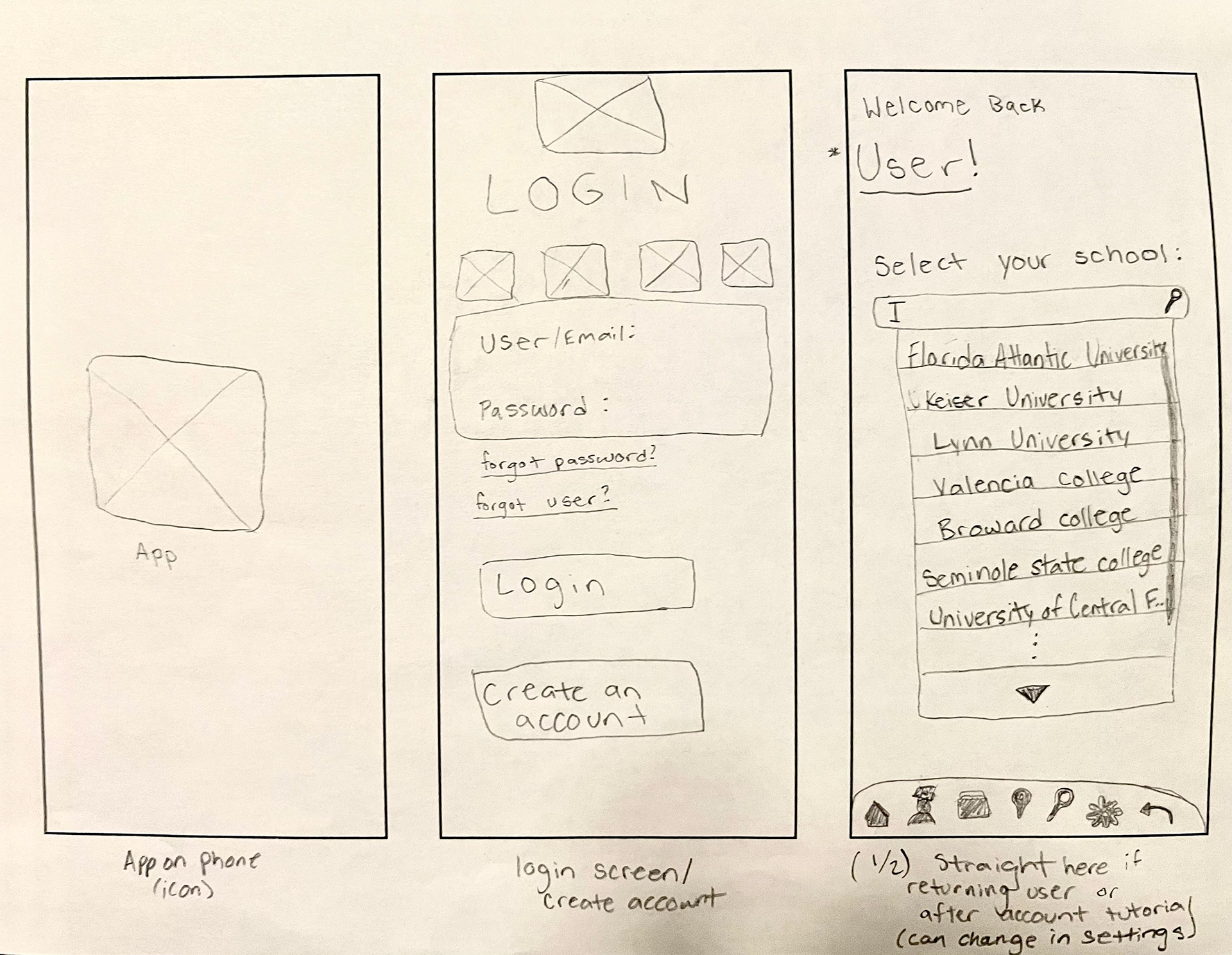
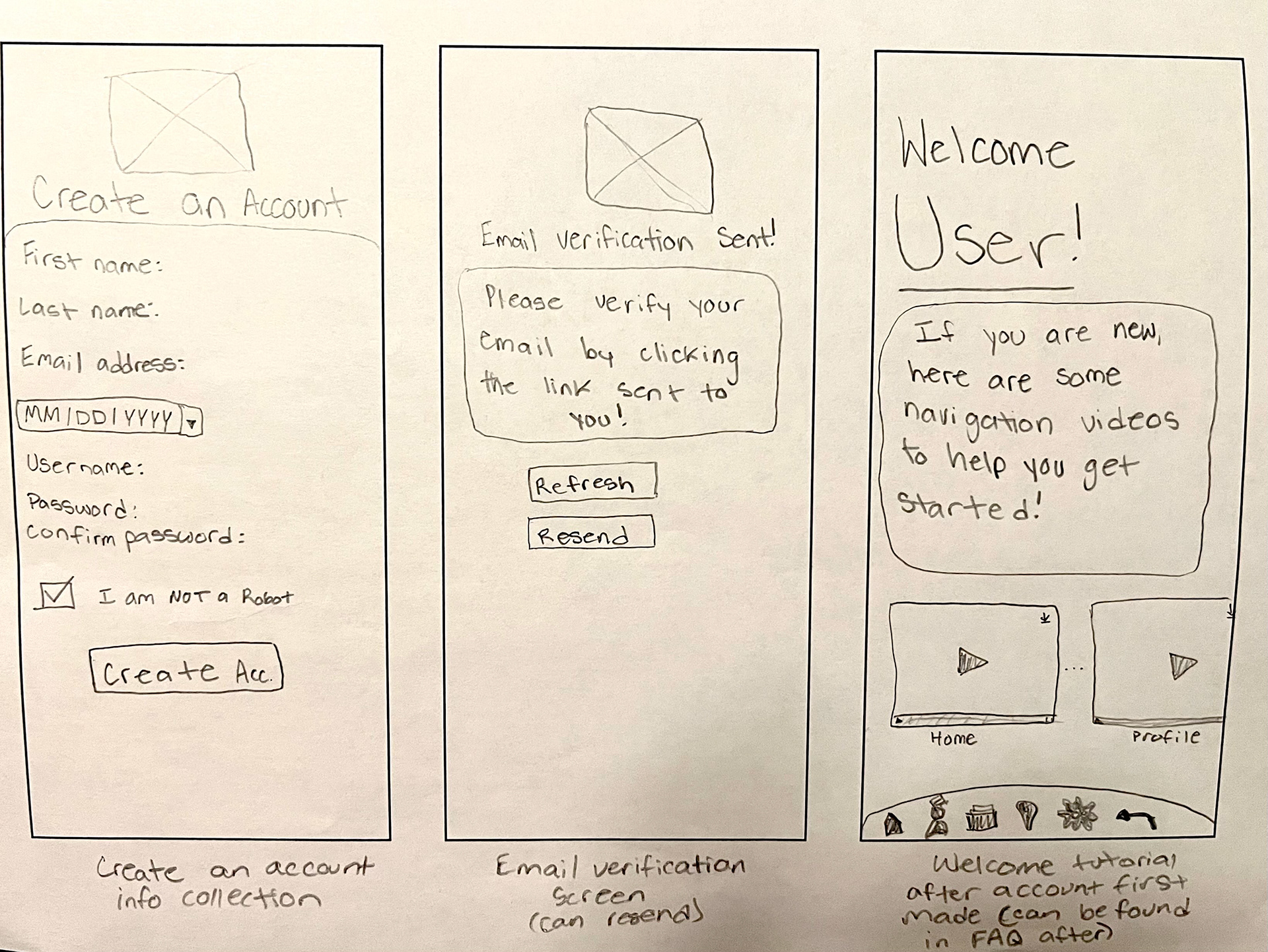
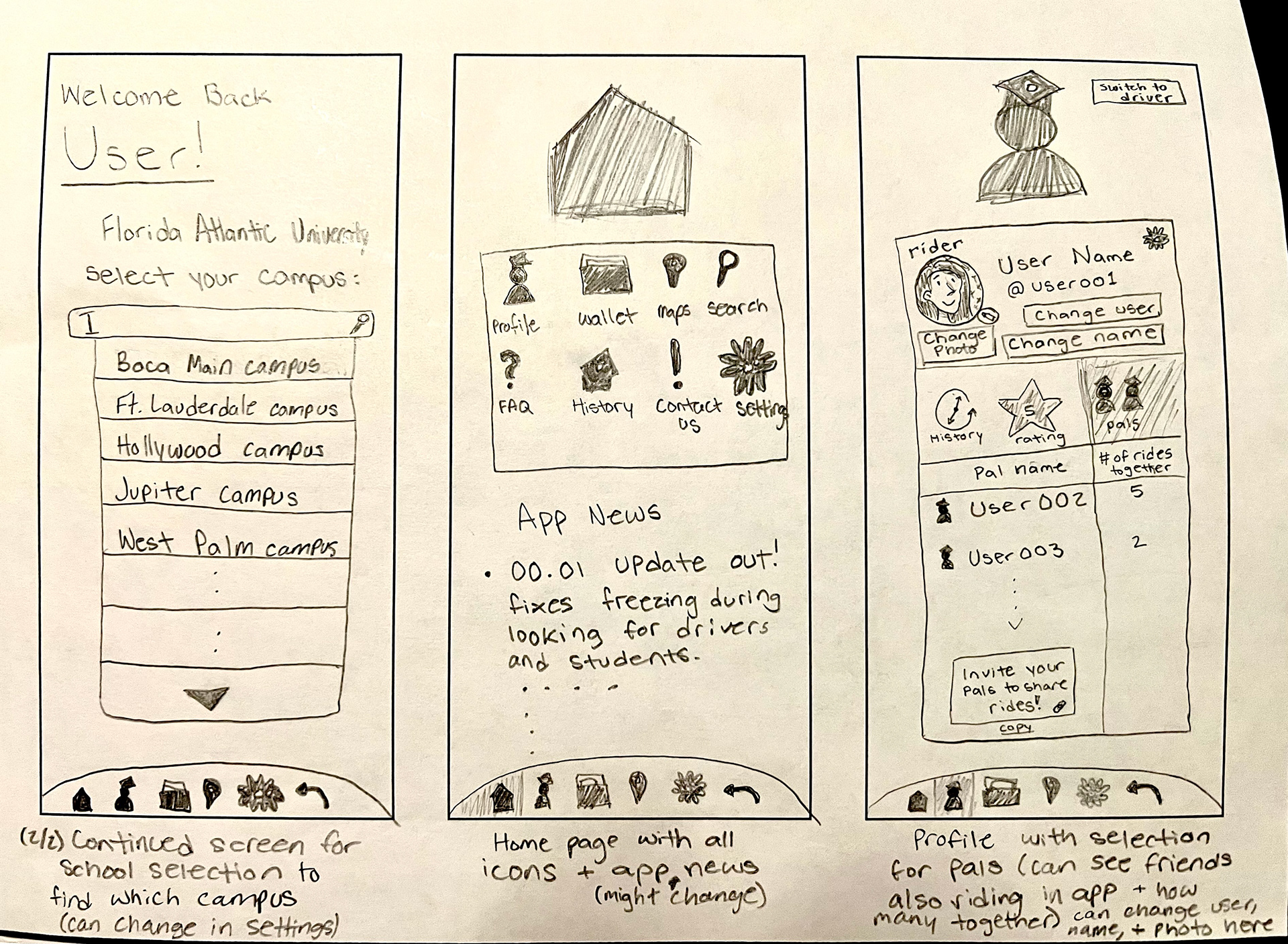
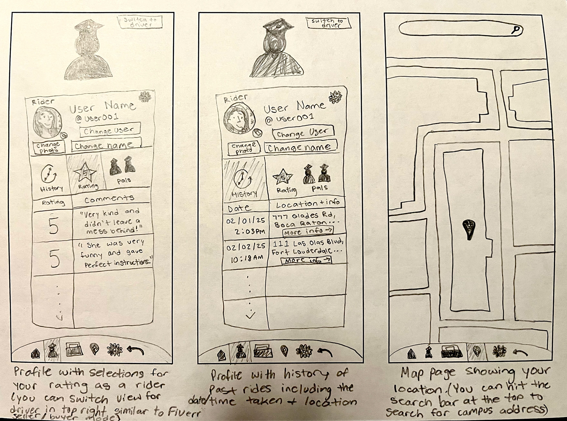
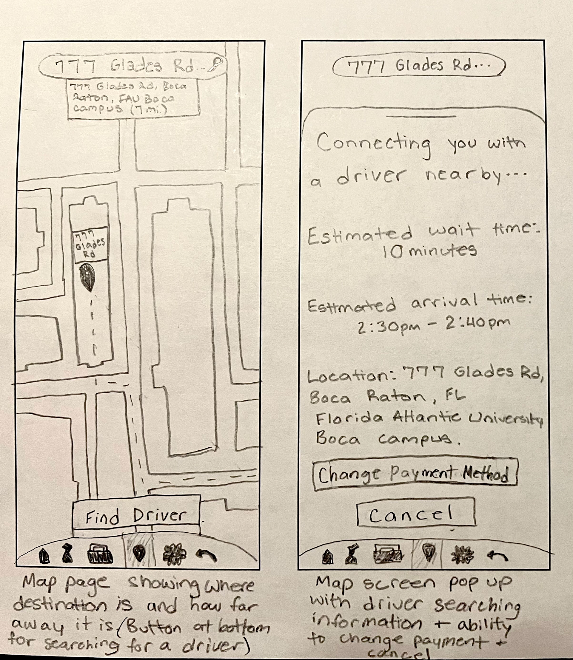
Wireframe Sketches
My sketches from left to right show my thought process when first coming up with the idea to sketching out the layout I had envisioned for it. These are mid-fidelity paper prototypes so I could better understand what I was going for and what I was missing. I then used these sketches as a guide and imported them into Figma to start working on my frames.
Mid-Fidelity Wireframes
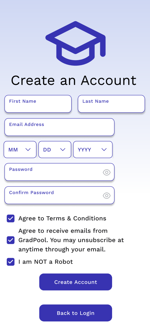
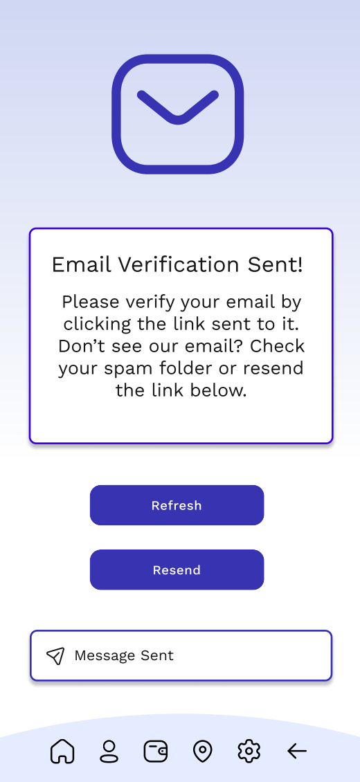
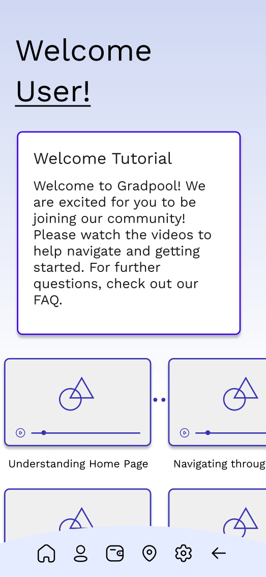
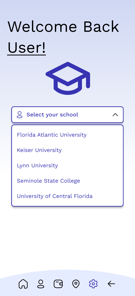
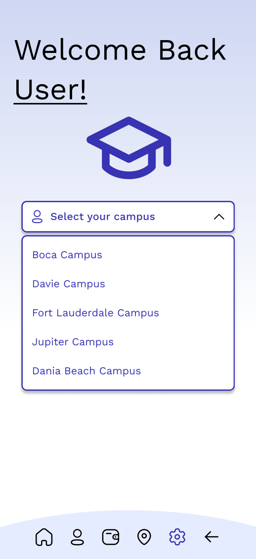
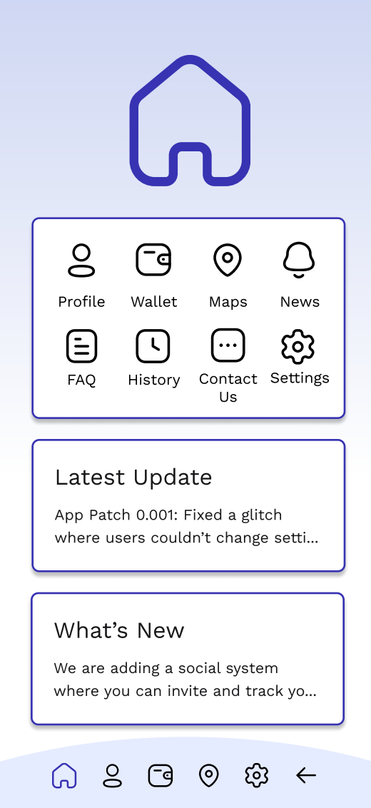
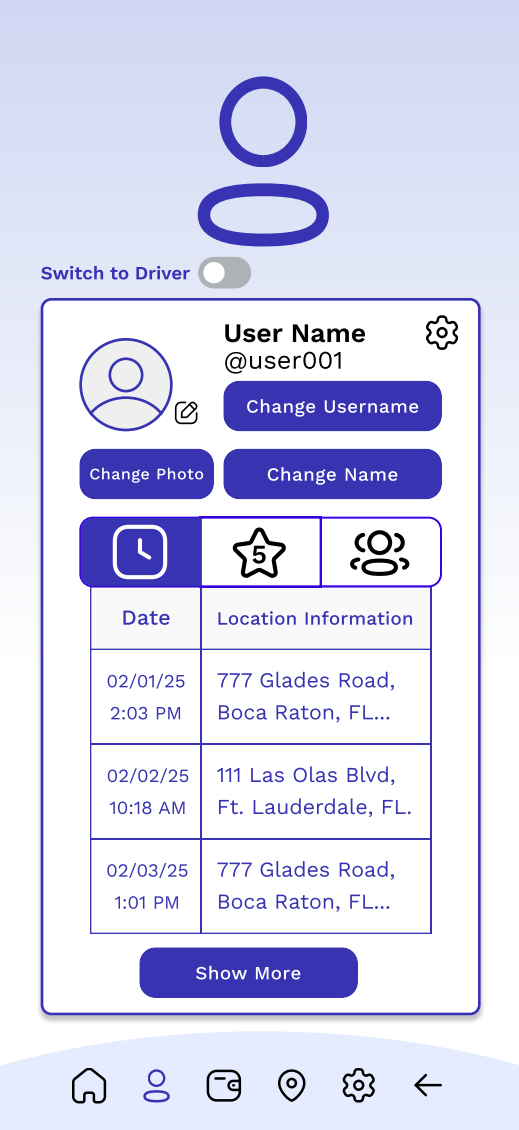
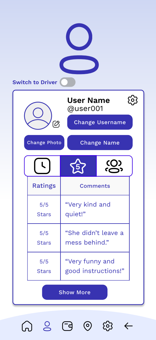
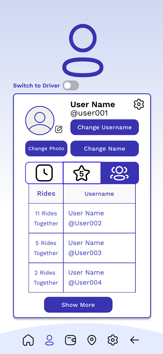
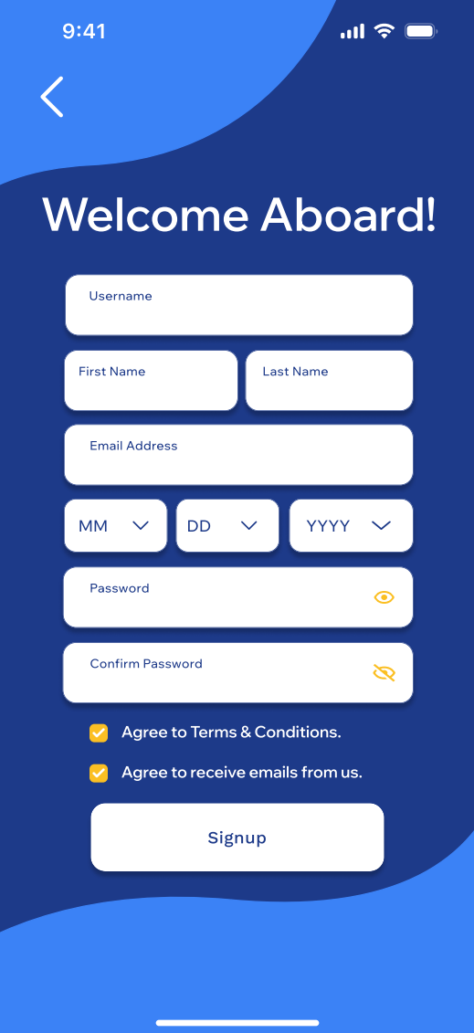
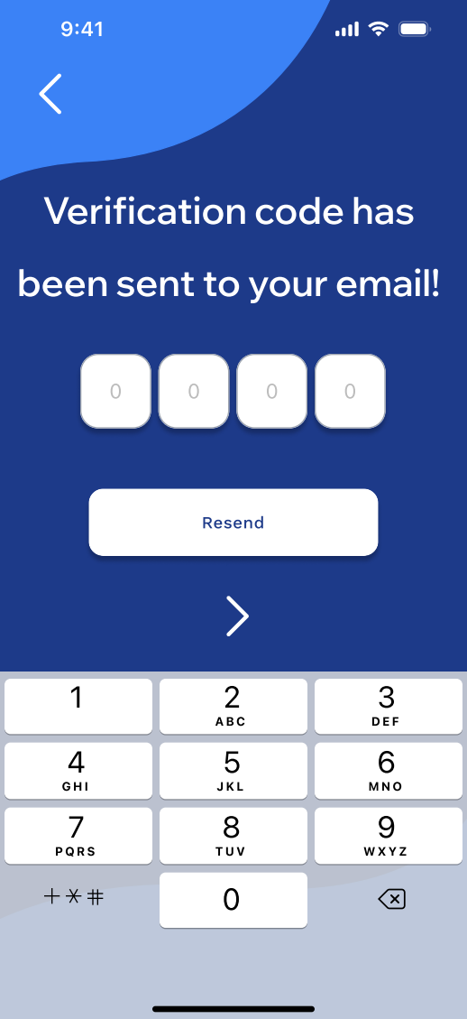
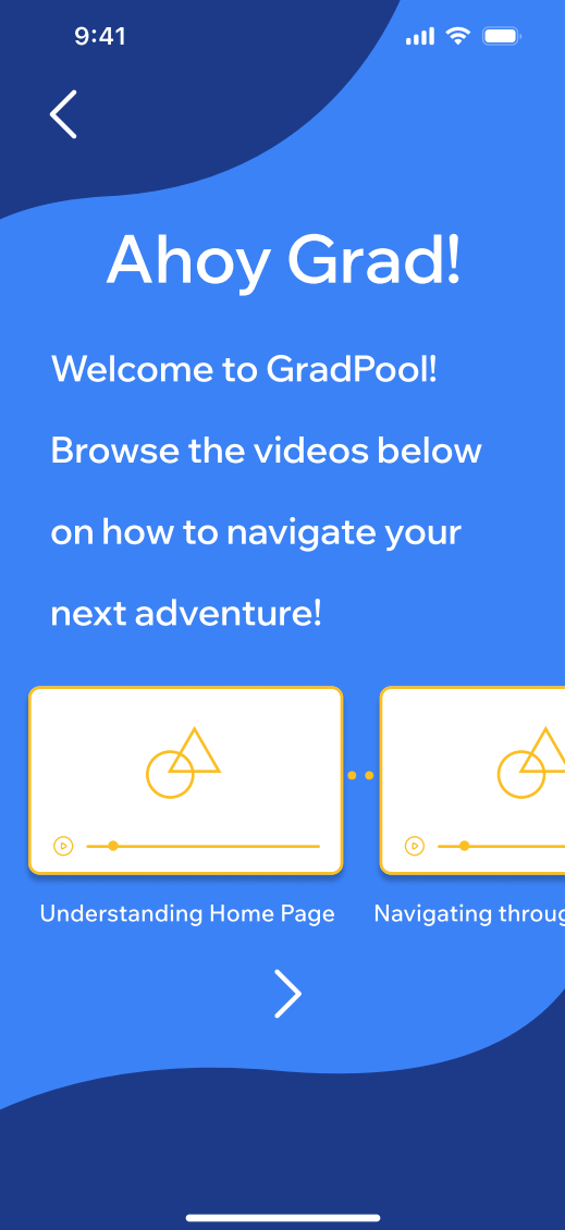
My mid-fidelity wireframes used free assets from Figma including the boxes to make sure it all went together in harmony. Since this was my first time using Figma I had some problems with alignment when switching between pages in prototype view. The overall layout of the wireframes was aligned according to each page but once played back all together, the screen would move one pixel to the left or right and so on. The login screen would have multiple apps for you to link and login through such as canvas or google, as well as your typical login that can be made though signing up. The create an account page would ask for your full name, email, birthday, and for you to create a password. You would also be able to agree to receive emails from GradPool by checking the bottom box. After you create an account, you would receive an email to verify your account, this is to help avoid fake accounts and multiple accounts from the same email. The following page is the welcome tutorial where if you had just signed up you can look at videos to help you navigate and setup your next upcoming ride with GradPool. This page is functional and you can scroll down vertically and horizontally to be able to better browse the videos. The profile page leads you to a place where you can change your photo, username, and actual name. You are able to navigate and click through the icons to see past rides, ratings and comments, and your GradPals! GradPals are your friends that you can add and invite to ride with you. There is also an option to switch to your driver profile as well. This was definitely great practice and a learning experience for me and future projects to come!

Feedback
I received feedback from fellow classmates working on apps and I was told to add more animation transitions and dialog options such as opening a dropdown or making a slide up screen animation for the finding driver screen. It was also mentioned to change the shade of blue used to a different color. Overall I still felt like this project was missing something bigger and talked to some friends I know that do freelance graphic design and UX design. I was told that the color palette was too monochrome, similar to what a classmate had said. My friend had also told me that the large icons were useless since users would already know they were on that page due to the bottom bar. He told me to put it in black and white first to see if it looks good and go from there and I noticed that overall layout of it was not working in my favor and I was stuck on what to do for a while, to me it seemed like an underdeveloped app that would have some kind of problem in the marketplace later down the line and overall seemed flat with the gradient background and still with a colored one. I made up my mind and decided to completely start from scratch. This time with more passion then the first!
Complete Rebuild
New User Flowchart
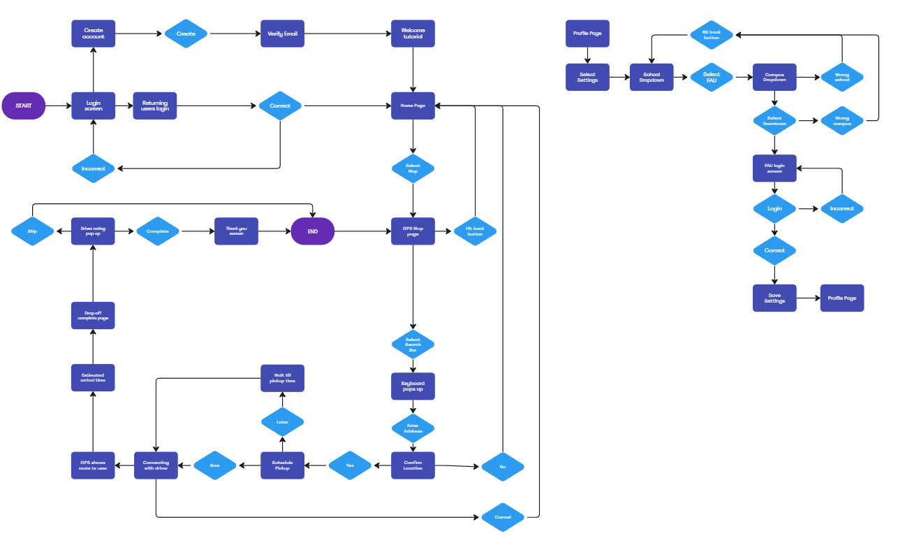
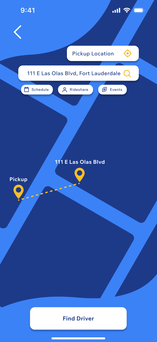
The new user flowchart moved the school and campus page to its own flowchart since they have been moved into the account settings under the profile page. I also added the option to save the settings in my new high-fidelity prototype which will take you back to the profile/account page once clicked. I also moved around the end of the first flow chart to go back to the map page instead of the home page once the trip is completed and you rate the driver. This is for a smoother transition since the user would already be on the map page from the ride.
New Color Palette


The updated color palette now has more energy and still utilizes blue shades. I wanted the color palette to convey fun and still be connected to the idea of graduation colors. There is more contrast with this palette compared to the older one which also helped bring out the text and buttons with more of what I intended.
New Fonts
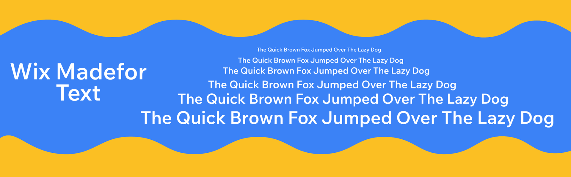
These new fonts I put more thought into compared to the mid-fidelity prototype which utilized work sans in different weights. This one feels more modern and is still easy to read which works well with my student audience.
New Style
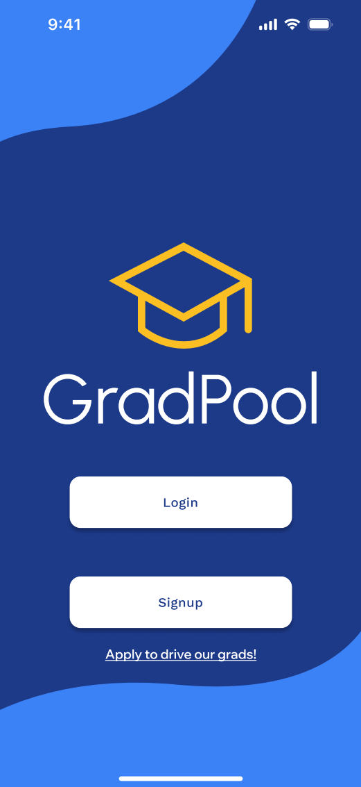
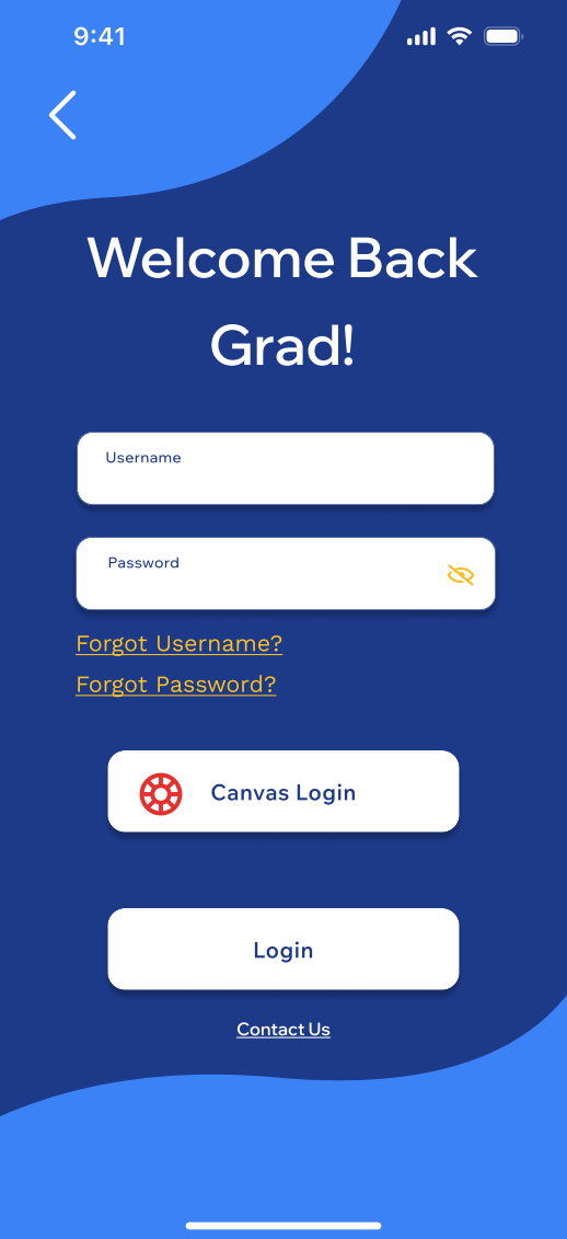
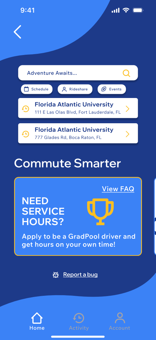
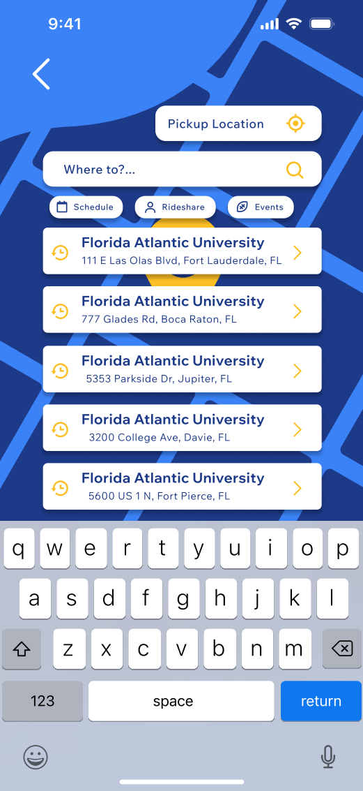

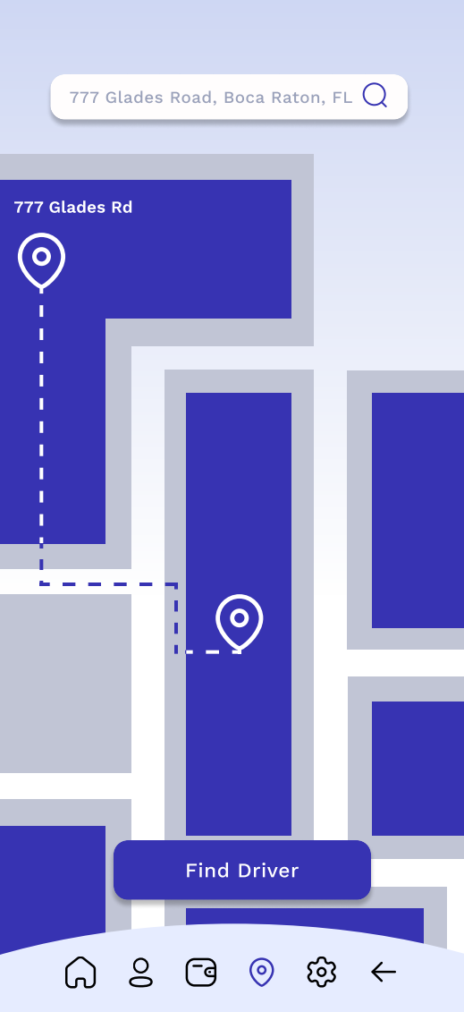
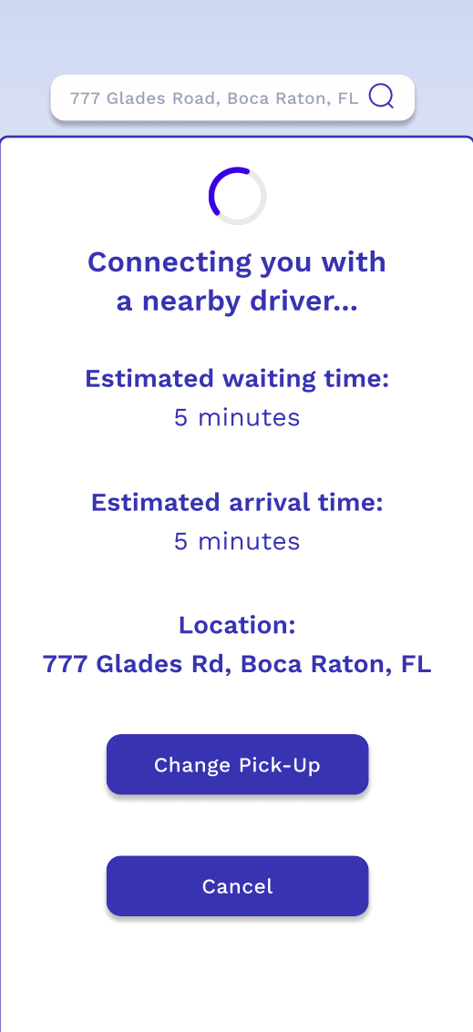
My new high-fidelity prototype is more fun to look at due to the color contrast with the colorful backgrounds and bright yellows and whites being the primary focus of text and icons. I was not happy with how the mid-fidelity turned out due to the feeling of emptiness and lack of emotion. I removed the large icons that I had added towards the top of each page since prior feedback given had mentioned that it was useless since the user would already know they are on that page through use of the bottom bar and other popular phone app layouts. I was able to do more extensive research on these popular layouts and downloaded a multitude of carpooling apps similar to what I am creating with GradPool. Some of these apps include of Uber and Lyft, two extremely well-known commuting apps. I also had created a mood board on Behance with works that I thought gave a similar emotion that I am trying to convey as well as other projects that had neat and simple layouts that I could follow along with and make it my own. My home page is has been completely redone due to comments about unnecessary icons and app news. I have decided to go for a more carpool app approach using Lyft as a reference. I also used the empty space on the home page to add little ads similar to Uber where you would be able to click them and go to those pages to learn more about them.
One of the ads involves where to find accessibility cars and another about working for service hours since this is an app for students by students. I understand the hardship of finding services hours and not having the time to be able to give up one or two specific days of the week. Another addition to the home page is a tab for events. This tab would tell you about tailgates and other school events going on and would give you the option to plan ahead and book a ride to and from there. This app values the students and school events can be hard to get out of due to heavy traffic in parking garages and drivers under the influence.
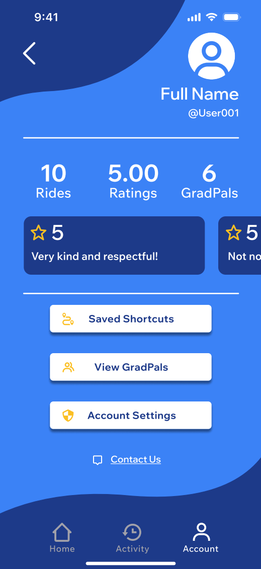
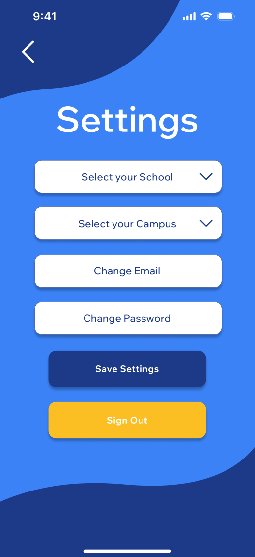
In relation to the profile page I have now renamed it to the account page. The account page layout has also significantly changed in terms of viewing your GradPals and ratings. The most recent ratings will appear in a section where you can scroll at the top of the page and to view the rest you would have to click the ratings main icon. The GradPals has its own button above account settings where you would be able to see all your friends you have invited and see how many rides you guys have taken together. You would be able to add friends through a search bar that would be at the top similar to the map search bar. There would also be an option to invite friends which would copy a link you would send to them in case you do not know their user name. This page will also have a way to get to account settings such as changing your school if you transfer or changing your main campus to view specific events such as lecture series in Ft. Lauderdale campus.
I also added a method to sign out of your account there and a save settings option. This time around I had gotten use to using Figma and was able to navigate it a lot more smoothly in terms of alignment and adding animations. I can now say with confidence that I am proud of this design compared to my mid-fidelity one due to the amount of life and understanding this time around. This version has less pages as of right now, 12 pages compared to the 14 pages from mid-fidelity, but I am hoping to continue working on it and updating it when needed.
Final Thoughts
With the final prototype completed, I feel more confident than I did in the beginning of the process. I believe that after redoing the prototype I was able to start with a clear mind and truly create something I can be proud of. This prototype perfectly conveyed what I wanted it to and successfully completes the needs and pain points of students.
Next Step
My next step is to continue to work on GradPool and be able to make it a live app in the App Store after it goes through a development team. Until then I will be doing even more research and updates to perfect my prototype and the idea in general!