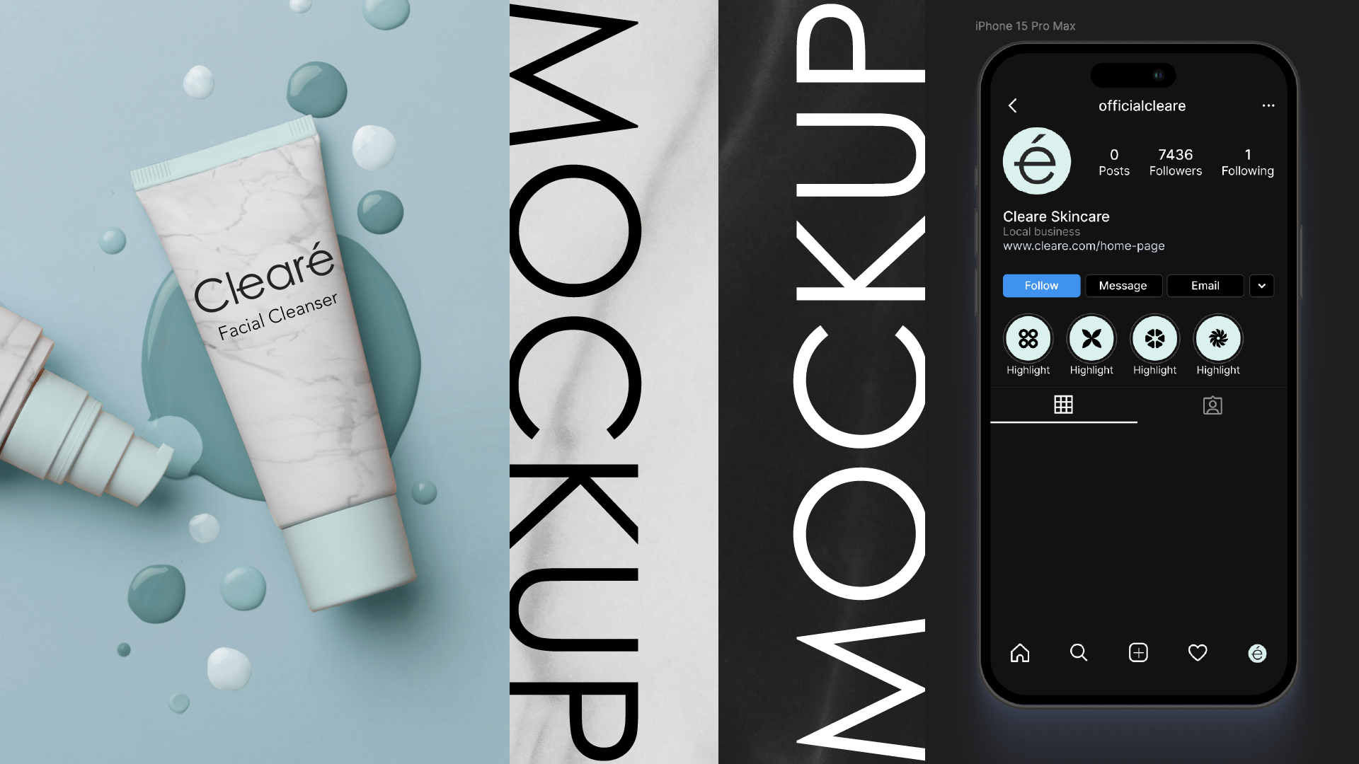
Clearé Branding
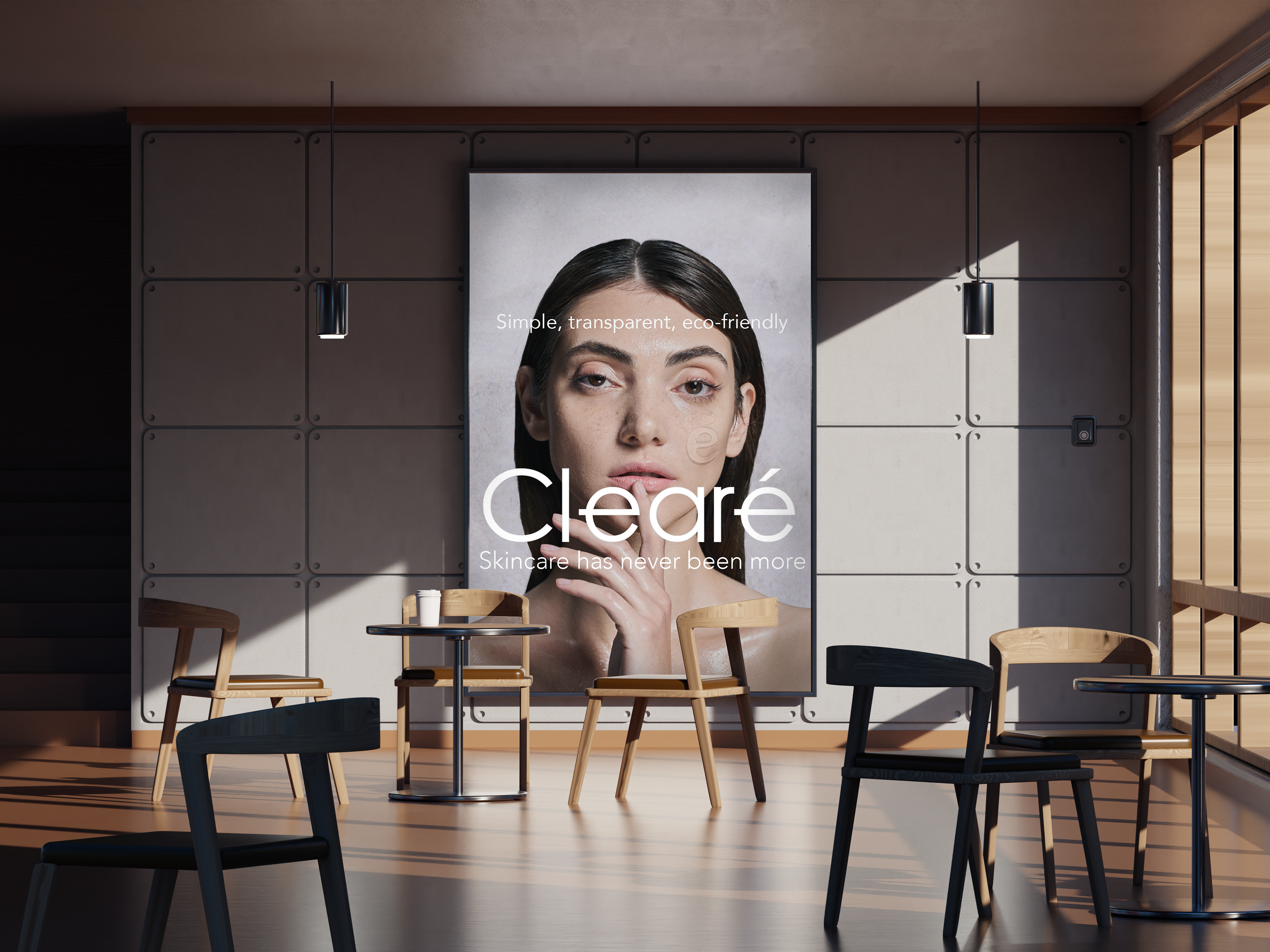
System Design
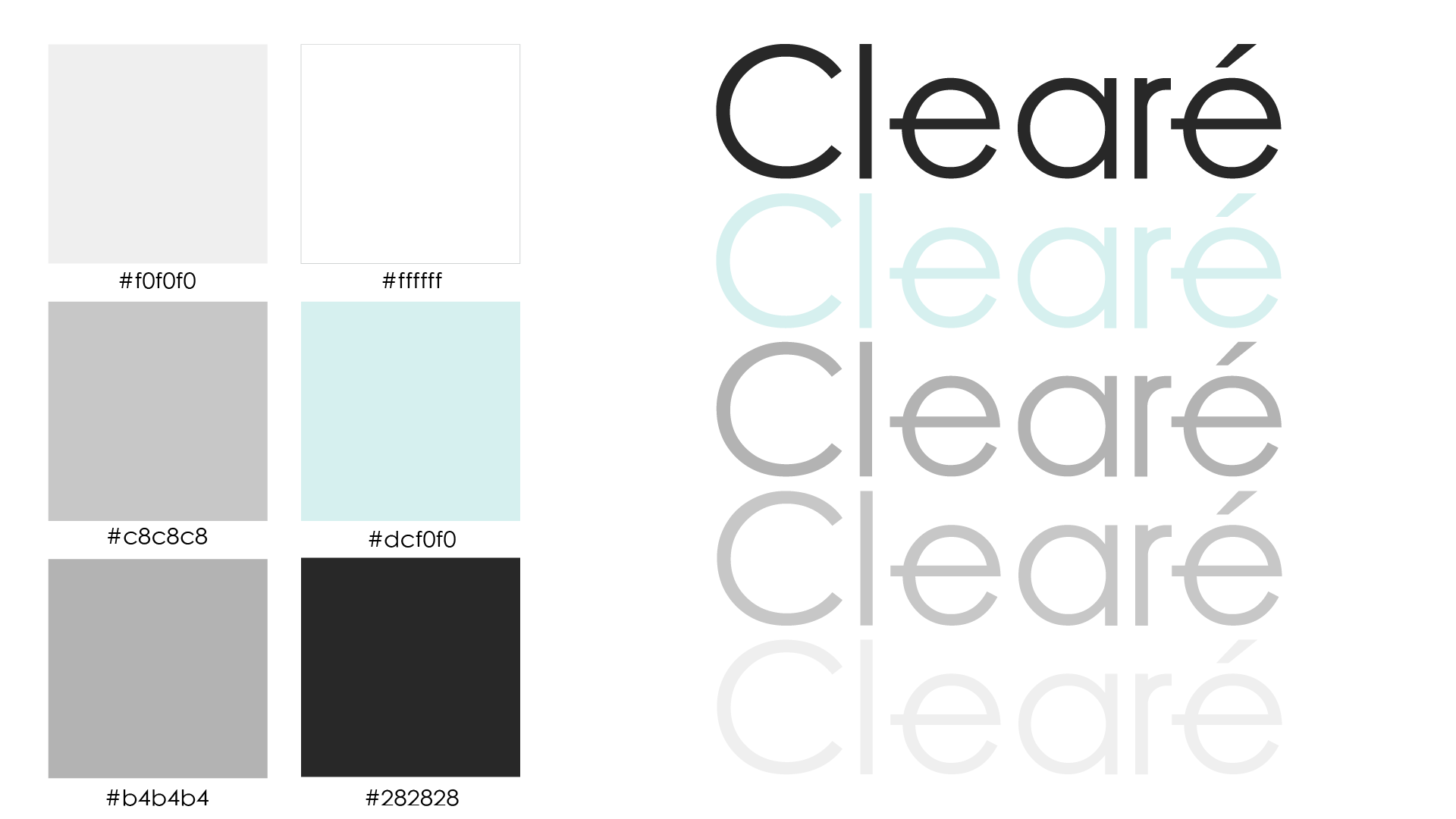
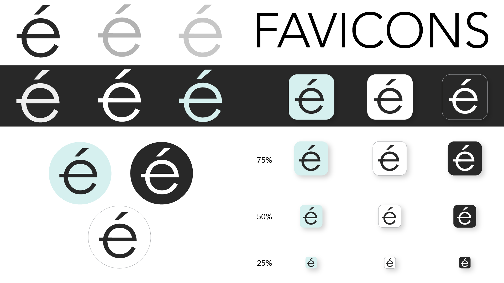
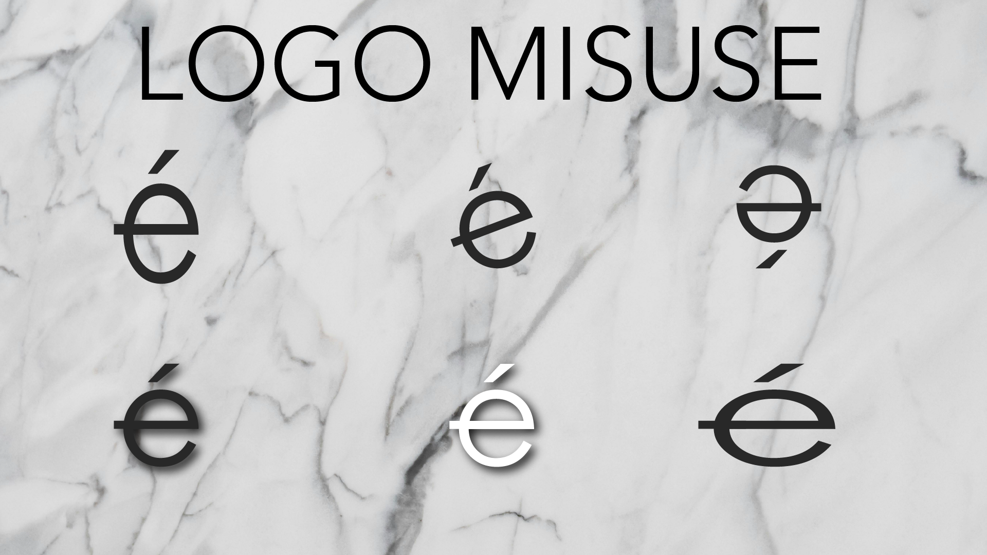
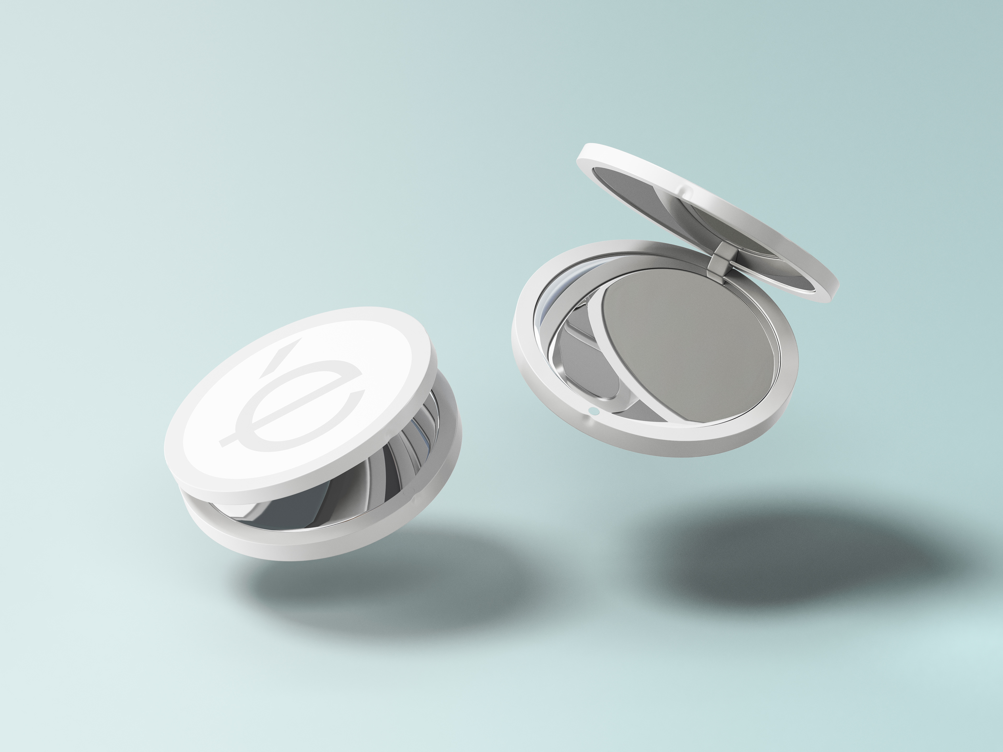
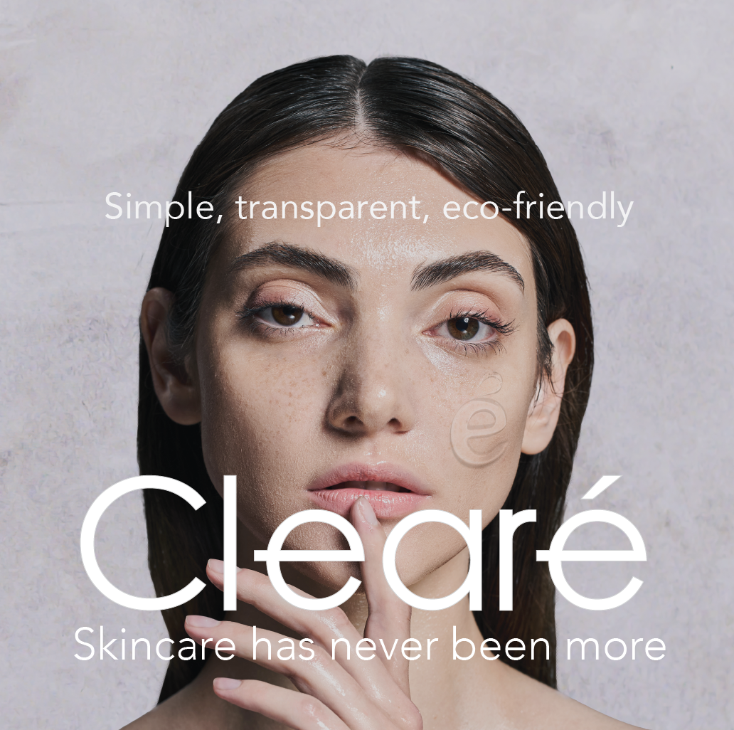
Mixed sizing
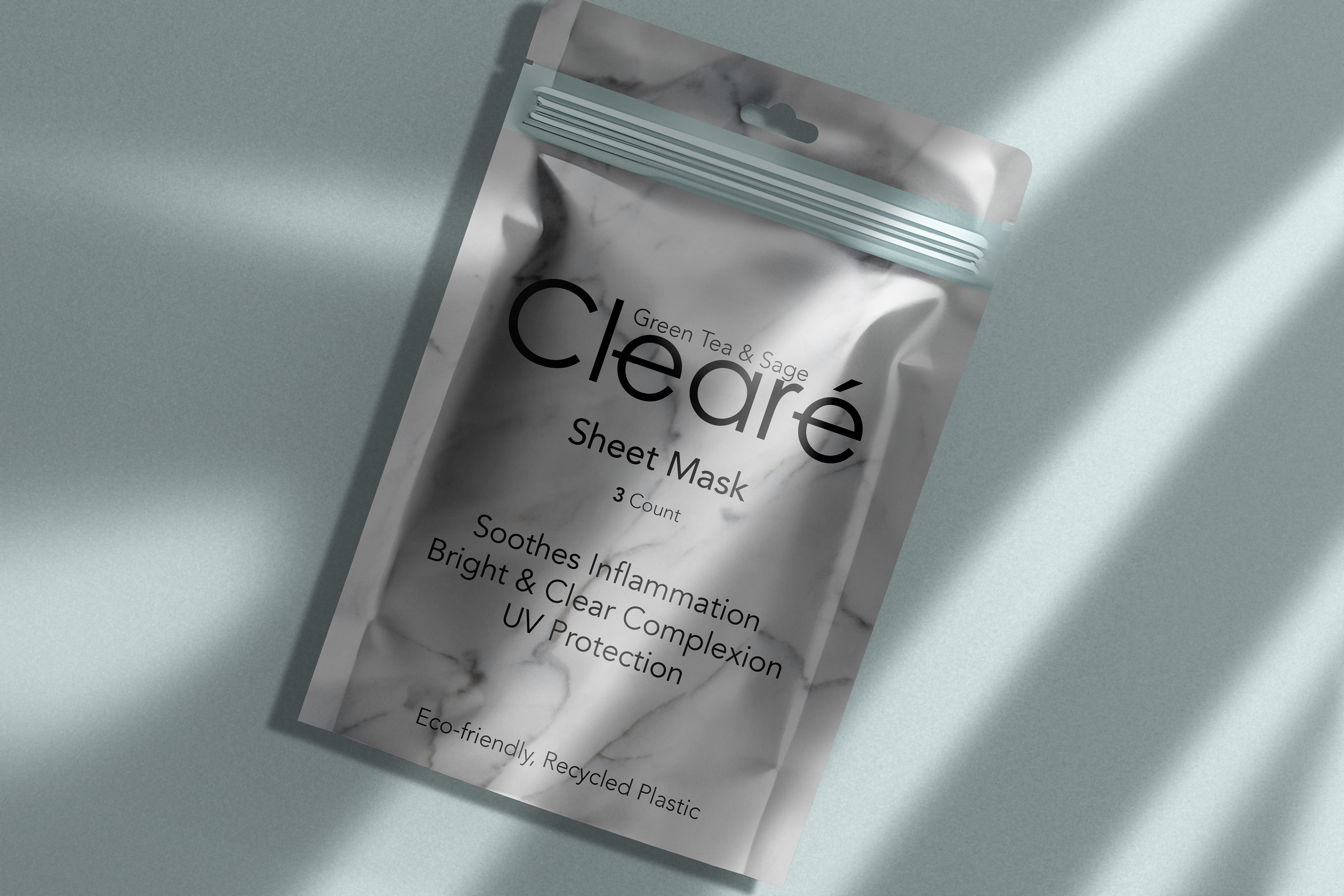
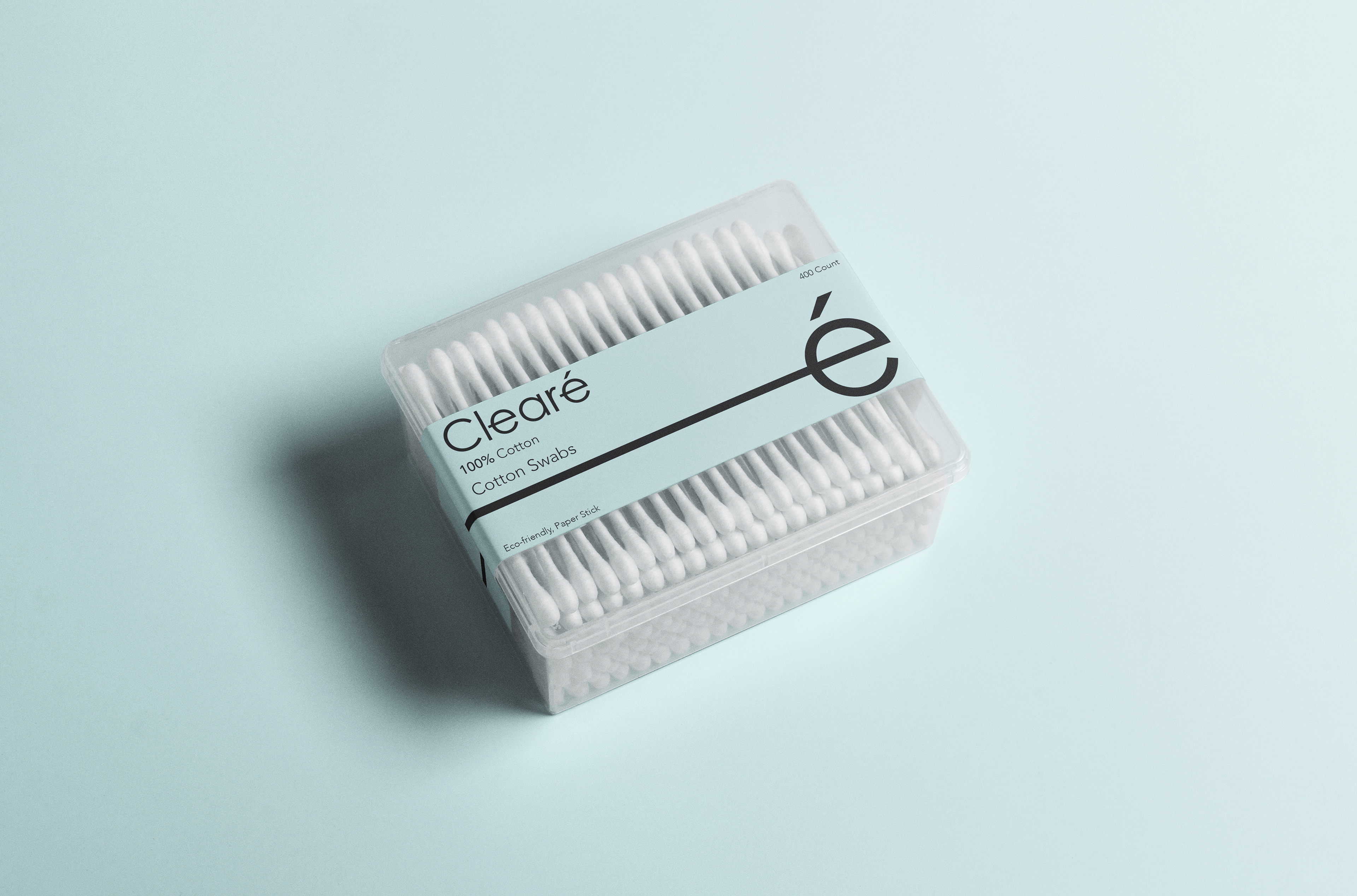
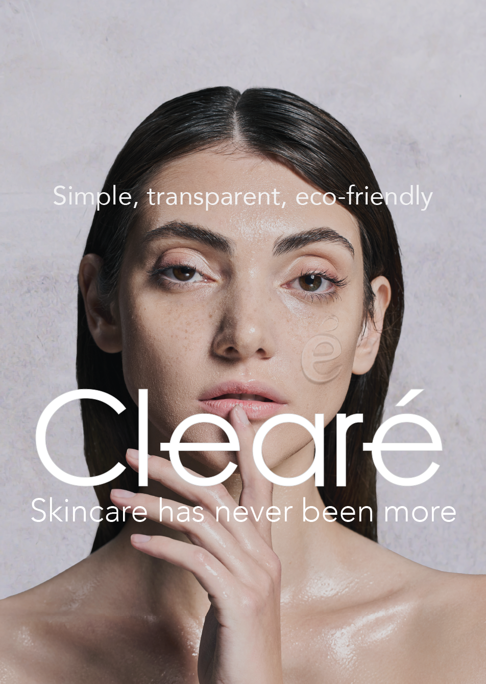
Clearé uses sustainable packaging and honest simple ingredients to create skincare products. The brand’s color palette is very light to reference translucent materials. The simple font conveys honesty and professionalism. All the design decisions convey the brand’s message of sophistication, sincerity, and reliability.
Progress Book
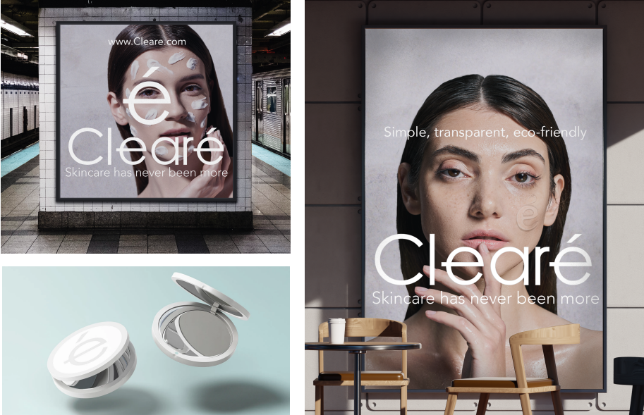
Clearé wants to provide beautiful skin for ages in our customers while feeling good doing so. As a company, we work on the perfect formula for preventing breakouts and signs of aging through natural ingredients. Our purpose is to reduce plastic waste by using recycled plastic as well as helping others receive the great skin that they deserve. Customers are located in the United States. A great portion live in New York and California in the busy city life. Our target audience is workaholics in their 30s, who don't have the time to do confusing skincare routines.
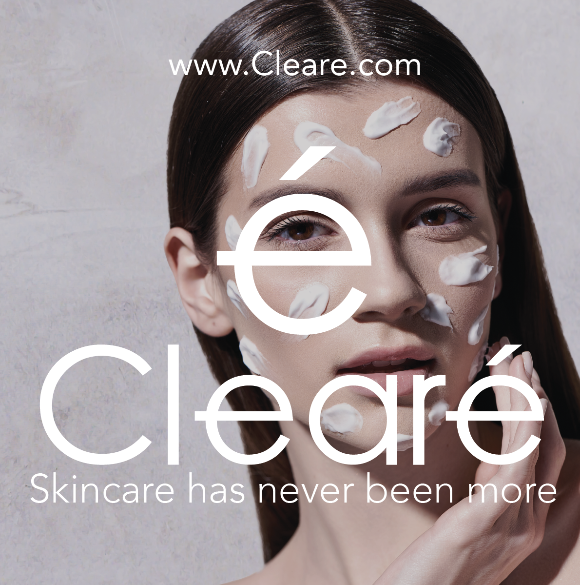
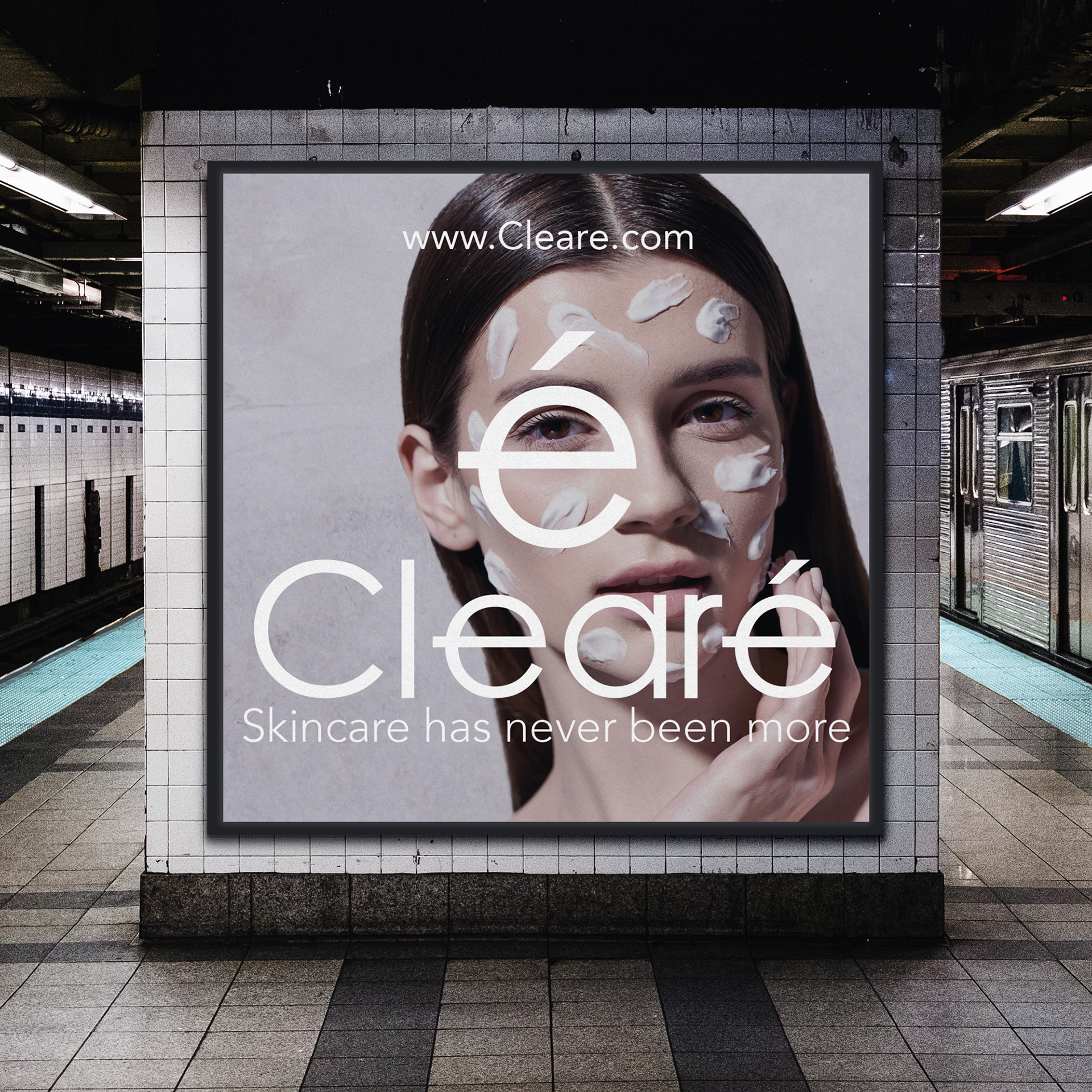
This is a creative advertisement, playing with words through facial serum. The goal is brand awareness since our signature "e" is being shown through the serum. The emotions I want to convey correspond with our personality of being transparent. There were some challenges creating the "e" shape out of the serum but overall the final outcome came out how I had envisioned it.
After creating Cleare, I learned how to plan better for future brands. Since I wanted my brand to be minimalistic, it was challenging to come up with a style and play with heavy negative space. Overall, I am happy with how it turned out in the end because the more I worked on it, the more I learned what works for the brand.